Embracing Chaos

Not having any pending deadlines or committments for my work,
I’m finding myself free to explore and experiment like never before.
My goal to be less representational and more “expressive”
has opened me up to all kinds of discoveries.

IMG_5182.jpeg

I think this one is finished for now.

I’m not using a reference
and am trying to allow the painting to evolve on it’s own.
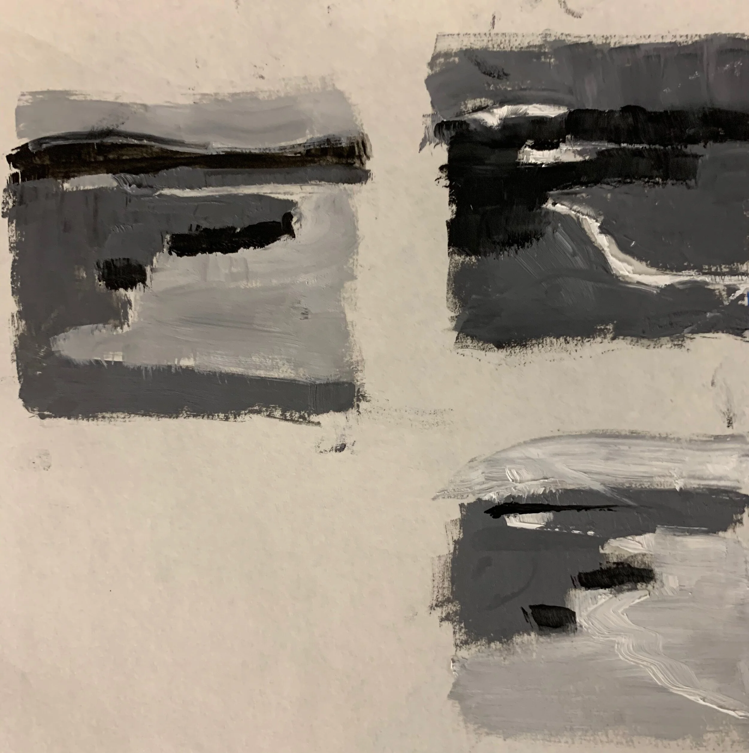
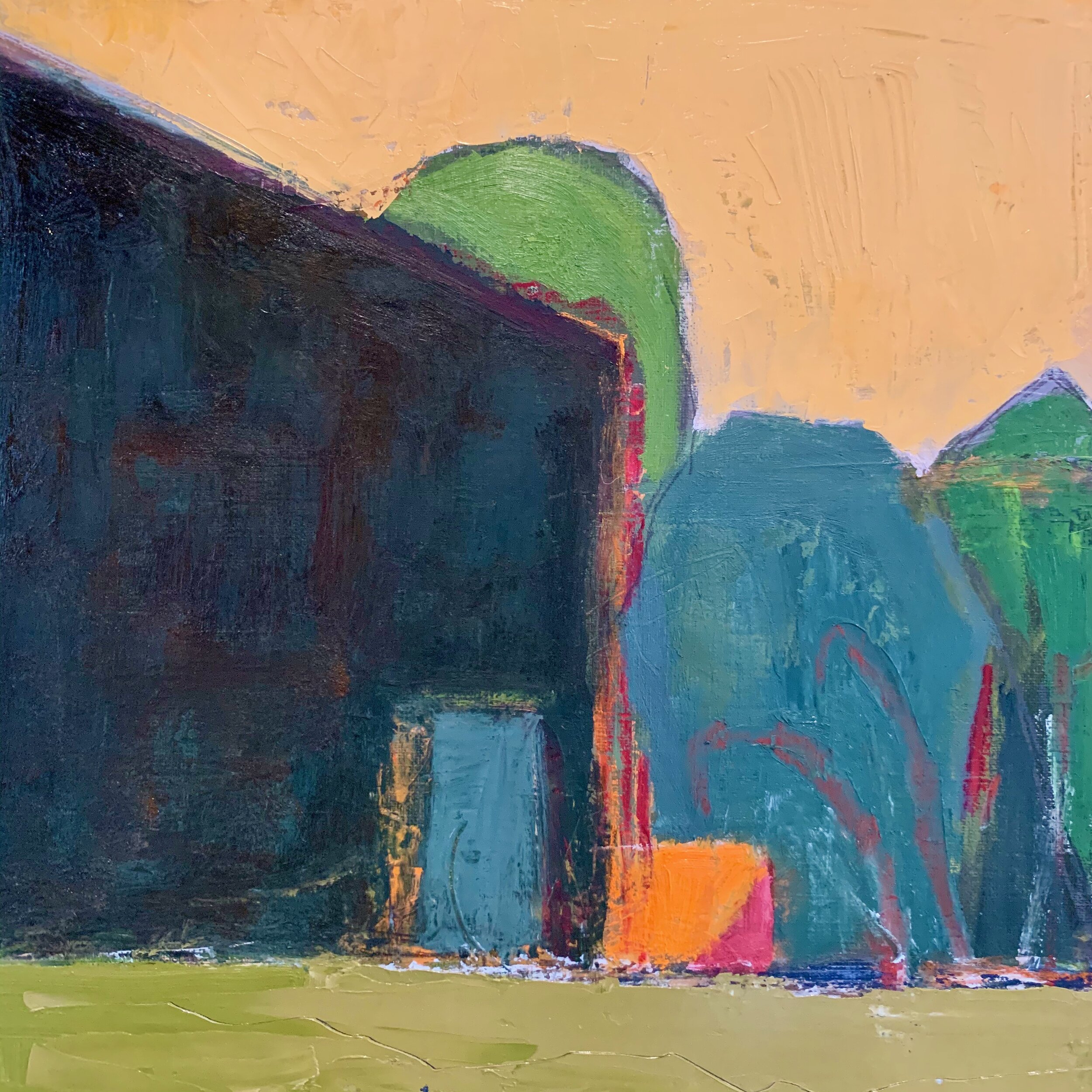
This was becoming a landscape, (below) however
I thought the shapes were all too similar in size
and I didn’t like that blue shape.

IMG_5014.jpeg

So this is pretty much when the chaos started.

IMG_5174.jpeg

At this point, I was ready to scrape it off and start over.

However, I’m teaching myself to work through those moments
when I have no idea what I’m doing.
I’m trying to “embrace the chaos”
and am finding it quite exhilarating!

Probably a good way to approach life these days.

Meditation Painting


I re-visited a favorite Sunday traditon this week.
I listened to the live broadcast of the
First Parish Unitarian Church in Boston
11:00 service while painting.

I seem to be drawn toward the purple and yellow complements;
to me representing Easter, waking up, rebirth, renewal, hope, forsythia, azalea.
So this is what happened.
10 x 10 acrylic

 
IMG_5147 (1).jpeg

As I Iistened to the reality of what is actually happening,
I was buoyed by Rev. Kendrick’s message of survival and hope.
We are all going to be changed by this
and mostly it will be for the good.
My grandmother always said:
”Greatness is never achieved, until one has suffered.”
Nelson Mandela


Thinking Abstractly


Since the world feels like it’s upside down,
I quess this is as good a time as any to experiement with abstracts.
I’m getting inspired by on-line classes, pinterest and
books on abstract painting;
Jane Davies’ Abstract Painting in particular.
After a long walk in the woods yesterday,
I did these from memory.

IMG_5095 (1).jpeg
IMG_5093.jpeg

These are both acrylic on paper.
I used a limited pallette of cad orange, cad yellow,
dioxide purple, red oxide and cobalt turguoise.
I also focussed on varying the shapes, lines and negative spaces.

This is a whole new world, literally and navigating it
in a positie way is a challenge.
More than ever, documenting my artistic journey gives me solace
and I welcome you along.
We can do this!


Thick juicy paint


I’ve recently gone back to using oils and it’s wonderful to
feel that thick juicey paint on the brush again.
I was inspired to do this simplified landscape
yesterday.

IMG_5076 (1).jpeg

“Spring Ahead”
10 x 10 oil

I used this dramatic image below
(a friend posted on FB) for inspiration.
I mainly focussed on contrasting those gorgeous spring pastels
with all the winter neutrals.
And that sky!

89760529_10220692216550602_9191491632782901248_n.jpeg

This is a wonderful time to get out and explore the landscape.
I encourage everyone to dig deep into their creative selves
during this unexpected “free time”.
Draw, cook, sew, paint, glue,….
everyone is an artis!


Life Interrupted


I cherish winter, when things generally slow down
and long hours to work alone in the studio are available.
However, I find teaching a weekly class, giving private lessons
and meeting up with like minded pals
keeps me inspired and engaged!

Now that all of that has been cancelled or postponed,
it looks like a walk in the woods is the ticket.

IMG_4355.jpeg

“Forest Bathing”
14 x 11 acrylic
Included in the James Library Annual Spring Juried Show
showing this month.
The opening reception has been postponed
but is open to the public.

IMG_5027.jpeg


”Gordon’s Pond”
16 x 16 oil

I did this from memory after a long walk yesterday.
It feels like the earth is waking up and coming alive again
after a very mild winter.
Stay tuned.
More to come, for sure.


Abstracting the Landscape


I’m not sure I’ll ever be a “full on” abstract painter
but I’m always looking for ways to make my work
less representational and more expressive.
This week I took it further than ever before in this “abstract” landscape.
My inspiration was that first day in spring
when the bright yellow forsythia pops in the midst
of all the muted purples and greys of winter.
No reference!

IMG_4925.jpeg

As you can imagine, this went though many
stages and versions and I was confused and frustrated
during most of the process.
But WOW.
It was great fun to let go
and just let the painting happen!
This could get interesting!

NOTE:
I got so involved while doing this,
I didn’t get any progress photos.
However, this is about where it started.

IMG_4884 (1).jpeg

Limited pallet of yellows, purples, sap green
and brilliant blue in oils and oil sticks.
I used a pallett knife and some scrapers
to push and pull the paint around.
After this, my main focus was
to keep it from looking like
a “real” landscape!


Adding Texture


I’ve been working almost exclusivley with acrylics lately
but have been wanting to use my “texture tools”;
scrapers, brayers, knives, oil sticks, etc.
I don’t find acrylics as easy to push around,
so I got my oil paints out this week.
I’m newly inspired!

IMG_4891.jpeg

I had a great time pushing the colors and shape sizes
while applying lots of texture.

I’m happily getting around to exploring some of the approaches
I recently taught in my Modern Painting class.
(Practice what you preach!)

NOTE:
Below is the “start” I did a month ago
10 x 10 oil on board

IMG_4261.jpeg

And this is the image I used as a reference.

IMG_7236.jpeg
 

Landscape Fun


I had some fun making this landscape more “modern”
using some of the approaches I teach in my class.

IMG_4736.jpeg

The landscape in New England in winter is generally
not very dramatic or inspiring.

IMG_4568.jpeg

I used this image for reference and then used the Procreate “pallet” below
(that I’d created from one of my bar scene ideas)
for a fun limited color scheme.
(I did add a little blue)

IMG_0613.jpeg

I’ll admit.
I’m a bit conflicted about using Procreate
and all the technology available to artists these days.
When I spend too much time on it
I feel like I should just be painting “for real.”

But then again, what you can do with it
is SO much fun!


More Bar Scenes


I’m finding the bar scene as a subject more fun than imagined.
For this series of quick acrylic skeches,
I have to be “on the sly “ to get the images.
I take a ton of quick pics with my phone,
sometimes pretending like I’m taking a selfie.

 
IMG_4686.jpeg


”Legal C”
8 x 8 acrylic sketch

IMG_4684.jpeg

“Beijing House”
7 x 10 acrylic

Living in New England in the winter is challenging
for those of us who crave color.
So indoors we go!

Bar Scenes


My husband is in the hospitality business so we
spend a lot of time in restaurants and bars.
I recently realized the potential for subject matter there;
the lighting, the body language, the narratives.
I’ve been experimenting with a series of quick, acrylic
sketches on canvas paper.

IMG_4433.jpeg

Down Time
12 x 10 acrylic

IMG_4478 (1).jpeg

Date Night
12 x 10 acrylic

IMG_4585.jpeg

“Dorchester Brewery”
12 x 10

Not sure what I’ll do with these
but it’s been great fun to re-visit figures again.
I hope you are all having a wonderful mid-winter!


Mid-Winter Up Date


For the last Modern Painting class this session,
we talked about edges, surfaces, and texture.
This is one of the most personal and expressive elements to painting,
so I wasn’t surprised to see such varying interpretations of the ideas.

IMG_4476.jpeg

We painted over old paintings and used
charcole, oil sticks, knives, screens, etc.
to apply and manipulate the paint.

IMG_4475.jpeg

Note the added paper!

IMG_4470.jpeg

This was a happy surprise!

Look at the thick paint on that boat!

This new format seemed to work well for everyone, especially me.
The group was made up of 12 talented, experienced painters,
all working in different mediums.
Each week we discussed and explored a new
design element of painting;
then each artist worked independently.
We spent a lot time experimenting and sharing our results
and certainly, everyone benefits from that.
I hope to be doing more of these classes soon.

Stay Tuned:
I’m taking a Procreate (I Pad) class !


Back to Basics

I’ve recently begun teaching private painting lessons in my studio.
The students are all beginners
so it has been great fun to re-visit the basics
with simple still life set ups.
Here are a few of my quick acrylic demos.

IMG_4358.jpeg
IMG_4291.jpeg

I use pears and apples set in strong light
because they are recognizable and fairly easy to draw.
Also, the stems are good “indicators” of where the light is coming from!
Teaching others what I know is incredibly fulfilling
and it certainly keeps me on my toes!


A Series in the Works


My exploration of beach structures as a subject continues.
Most of the homes in our local beach communities
are closed up for the winter,
eliminating most human presence.
That allows me to focus on the quiet, calm stability
of all those right angles!

Here are few new ones for this series.

IMG_4278.jpeg

Sneek Peek
16 x 16 oil

IMG_4145.jpeg

In Between
16 x 16 oil

IMG_4277.jpeg

Red Sky at Night
18 x18 acrylic

Not sure how far I’ll go with this.
Thinking interiors might be
a great winter subject.

Happy Winter!


Designing with three values


We continued to explore the idea of
designing with three values in class this week.
To me, understanding and manipulating values
is the most important element of good design.
Using just three values is more difficult than you would think,
and everyone approached this in their own way.
Here a just a few samples of class work:

IMG_4276.jpeg

These are three value studies of a grey day landscape.
Which one has the most “punch” or drama?
(We all chose the top right)

IMG_4264.jpeg

Once we did our “plans” we chose one to translate into color.

IMG_4269 (1).jpeg


By presenting an idea or challenge each week,
and having them interpret it their own way;
helps us all learn from each other!

Happy Painting everyone!


Back to Oils


Last week I found a stack of square wood panels
(8 x 8, 10 x 10 , 12 x 12)
that I’d toned with bright acrylic colors.
After working with acrylics on paper lately,
I thought it’d be fun to get out the oils and
do some quick simplified architecture pieces.

IMG_4256 (1).jpeg

Lighthouse Road
12 x 12 oil

It was great fun to work with thick, juicy paint again!
(Everything is better with butter)

Then this one evolved after many “scrapes and bruises”
and it’s going to sit for awhile.
I’d forgotten how you can scrape and re-apply paint
using oils on a flat surface!

IMG_4261.jpeg


NOTE:

This was one of the early versions.
Too boring and expected.

IMG_4165.jpeg

Here’s another attempt.
Too many same sized shapes.

IMG_0566.jpeg


Bring on 2020


I set up this winter themed “still life” today
to kick off the new Modern Painting session.

IMG_4188.jpeg

We talked about the idea of designing a composition
using line to move the viewer’s eye.
Some worked from the still life
and some worked from images they chose.

Here’s the quick acrylic sketch I did
from a zoomed in I phone shot.


I had such a great time re-entering the class room,
I forgot to take any images of student work.
Stay tuned because we have a very brave and telented group
and I can’t wait to share.


Artist Interrupted


As much as I love the holidays
they certainly interrupt my “normal” routine.
I got into the studio today
(for what seemed like the first time in weeks)
and started the process of re-entering.

Colella_Nancy_From the 3rd Floor.jpeg

“From the 3rd Floor”
9 x 12 acrylic
I’d started this in early December
and finally got a chance to tweek it today.
(Entry for Small Works at Copley Society are due Jan 1!)

NOTE:
January is a favorite time of the year for me.
I go into hibernation mode;
enjoying long hours in the studio to explore, experiment,
and let the magic happen.

Happy New Year to all.
May 2020 be a filled with lot’s of
new ideas, happy accidents, and
breakthroughs!


Modern Painting


We had our last Modern Painting class at North River Arts this week
and I’m happy to say that this experiemental format worked out well.
Including artists of all levels, working in different mediums;
it became less about “how to paint” and more about
presenting a series of non-representational approaches
(with historical references, contemporary samples)
and letting everyone enterpret their own way.

This week we set up a holiday still life and the idea was to do a
“Pattern Painting” then do a collage from that.

IMG_0547.jpeg

This gal added paper to her painting and created this gem.

IMG_4008.jpeg

Many chose to work from their own images and at their own pace
so the level of creativity and surprise was elevated.
Here are my quick painting/ collage examples done from a black and white image.

IMG_0551.jpeg
IMG_4014.jpeg


The work done in this class was personal and experiemental,
which is the beauty of the class.
We all learn from each other!

IMG_4011.jpeg

Have a wonderful holiday season and
happy painting in 2020!


Same Sized Shapes


I have a habit of making all the shapes
in my paintings the same size
which creates repetitive and boring compositions.

IMG_3807.jpeg

This was the case here, so my solution was
to remove some of the unecessary shapes,
and simplify the values and colors.

IMG_3898.jpeg

I had fun letting this one tell me where to go.
I’m continually fascinated by how
altering the size of a shape or a value,
changes the entire painting.
The challenge continues!


Using Value to Move the Eye


As I continue to work on the “beach house” series
I’ve been exploring the use of value
to move the eye around a painting.
In this painting I wanted the viewer to land on the
door so I gave that area the highest value contrast.
(darkest dark against the lightest light)

IMG_3884.jpeg

Blue Door 10 x 10 acrylic

Below is the original that wasn’t working,
until I realized all the darks areas were competing with each other.
So I lightened the areas where I didn’t want the viewer to stay.

IMG_0543.jpeg

I’ve always been prone to exaggerate my values;
making the darks darker and the lights lighter
throughtout the entire painting.
Now I’m realizing that you can create more interest
( and therefore better paintings)
by controlling where you do that.