Coloraide Paper


Over the summer I’d been playing with the idea of
using golf courses as a subject matter.
Nothing much came from it so
yesterday I got out the Coloraide paper and started simplifying.

IMG_7486.jpeg

I tried to limit the shapes, colors and values
and just let the paper do it’s thing!

When I started cleaning up,
I realized that the negative shapes of paper that were left behind
could be used for a more abstract look.

IMG_7488.jpeg

Just placing the papers on a support in different patterns and arrangements
(before gluing) was inspiring and great therapy!

IMG_7489.jpeg

Like many artists these days, I’m having a hard time focussing
on one thing and feel rather rudderless.
For now, I just keep showing up in the studio
with the hope that something wonderful will happen!
Hang in there artist friends.


Collage Inspiration


I watched a terrific collage demo via Warehouse 521
on zoom this week with Nancy Gruskin
and it reminded me how much fun doing collage can be.
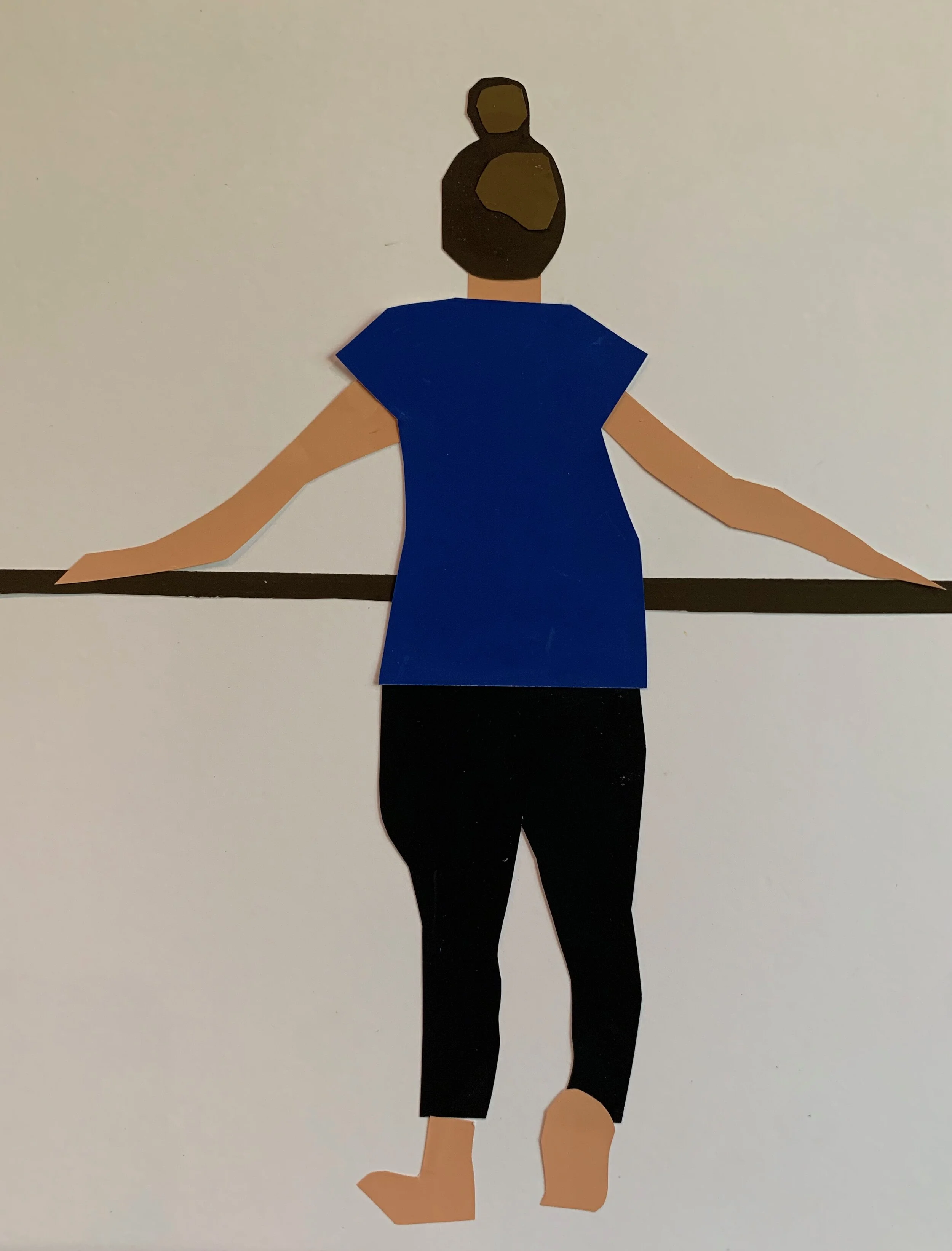
So I got out my coloraide paper
and just started cutting.
I did this in about 30 minutes.

IMG_7387.jpeg

“Kristen”
12 x 8
coloraid paper on mixed media board

I’d spent the day before working on this painting,
using my daughter-in-law as a model.

IMG_7357.jpeg

“Kristen”
12 x 16 oil

I think I painted over her legs a dozen times,
struggling to get the porportions just right.
Cutting them out of paper was SO much easier.

And much more fun!


Empty Chairs


A few years ago a woman from Dana Farber Cancer Center
came to my studio looking for paintings to hang in the chemo rooms.
She chose mostly beach scenes with people relaxing.
I had some wonderful paintings of chairs on decks and porches and in groups on the beach.
When I asked her why she didn’t take them,
she said they avoid any art that includes empty chairs, empty clothing,
and/or flowers in medical facilities!

That said, chairs will always be a favorite subject of mine.

IMG_7288.jpeg

Blue Chair
10 x 8 oil

This one looked a little too predictable so I think I’ll crop it
to this; making the chair less apparent.
Maybe that will engage the viewer longer?

IMG_7287.jpeg

6 x 4 cropped version


Looking forward to getting back into the studio full time.
Wrapping up summer at the beach….so it won’t be long.
Time to hunker down!


September Light


Every September I’m struck by the strong value patterns
created by the intense fall light.
And I love how it affects interiors.

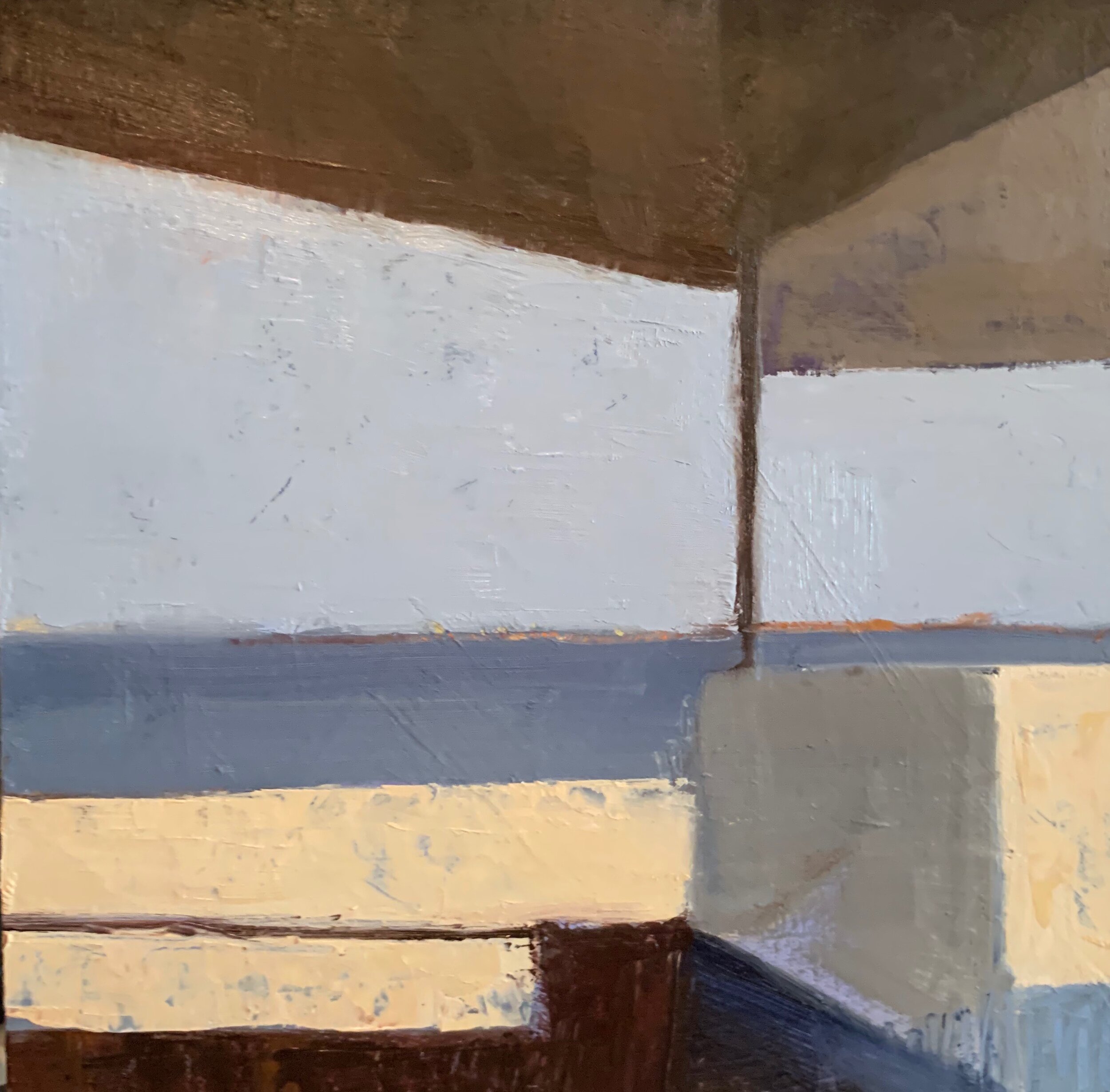
IMG_7113.jpeg

September Morning
10 x 10 oil sketch

I’m experimenting with zooming in order to avoid
“naming the subject” so I can focus more
on shapes and value.
The eternal struggle.


NOTE:
This week, the smoke from the fires out West
have created an eerie haze in our skies;
creating even more extraordinary light.
(Taken last night, no filter)

IMG_7215.jpeg


This could be fun to paint too!


Getting in "Trouble"

We had perfect beach days over Labor Day weekend
and people were soaking up every minute.

IMG_7103.jpeg

“Last Blast”
8 x 20 oil sketch

I couldn’t resist playing with this pose today.
(and I had an 8 x 20 board!)

At one point, I realized it
felt too “predictable”
so I took out the scrapers and
”messed it up”.

I’m trying to teach myself to
”get into a little trouble” in the studio.
I’m learning that it can lead to more
expressive, unexpected paintings.
And it’s more fun!
Scary but fun.


September


As much as I love summer, and living on the beach!
I always look forward to September.
I’m excited to clean up the studio,
get organized, and get back into a work mode.
A throw back from the “back to school” days, I guess.
(I vacuumed and ordered all new brushes today!)

IMG_6980.jpeg

The Grotto
8 x 10 oil study

Our house at the beach is a Mid Century Modern,
upside down, deck house.
Of course, the entire design focusses on geometric shapes;
rectangles, squares, and the movement of the light.
This is the entrance to the “lower level”.
It’s a magical place to be and has influenced many of my
current paintings.

I’m looking forward to the change of season
and all the new subject matter, inspiration, and ideas it will bring.
Have a safe and happy holiday
everyone.


One Hour Painting


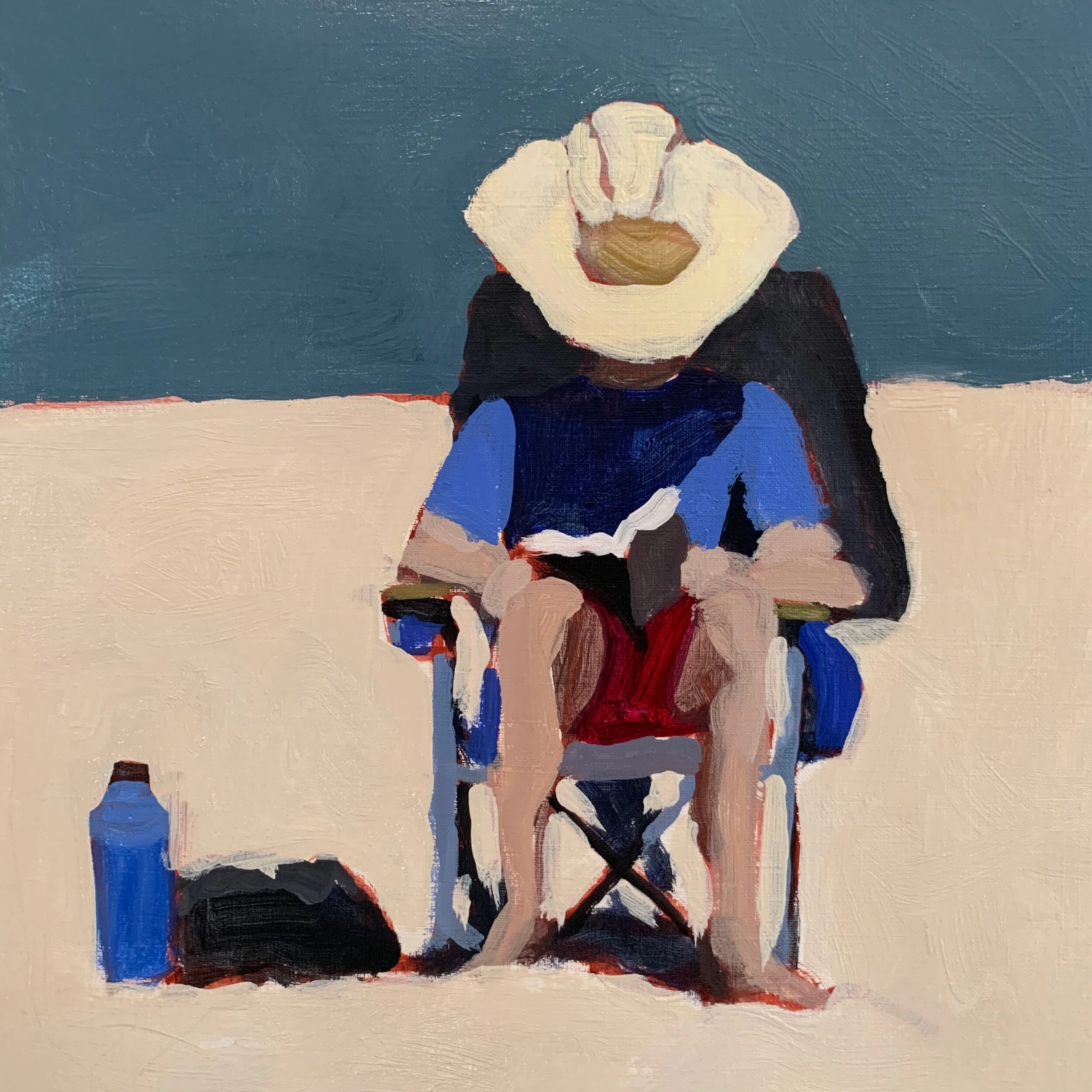
This man and his wonderful hat come to the beach
almost every day so I had to try to capture it.

IMG_6943.jpeg

I used to teach a class called the “One Hour Painting”
where you began with a simple “map” outling your shapes.

IMG_6941.jpeg

Then, starting with the darkest value, you mix each color,
put it down, and leave it.
It’s a great way to build a painting by focussing on the simple shapes;
almost like putting together a puzzel.
After so much experimenting with different approaches,
I find this way of painting very comforting and “safe”.

I’m working on putting together a series of virtual classes
(for all levels) and hope to have them available soon!


Combining Values


I’ve been experimenting with combining shapes of similar values
in order to further simplify the compositions.
I did this quick acrylic study today, then did the next one in Procreate,
exaggerating the big dark and light shapes.

IMG_6892.jpeg
IMG_0712.jpeg

I’ve discovered an easy way to check your values
as you work on an I pad;
you can press the home button 3 times
and the screen will revert to black and white.
(Press it three more times and it goes back to full color)

IMG_0712 (1).jpeg

I like this value plan , so I plan on taking this further,
possibly a full on abstract?

NOTE:
I’m working on putting together a series of virtual classes
that I hope to share very soon.
Although, right now, I’m trying to take advantage of
every minute we have left of summer!

Stay safe and enjoy!
See you in September.


Eliminating Details


I’m finding that once I eliminate most detail,
I can focus on the shapes and how they relate to one another.

IMG_6739.jpeg

Dry Summer
12 x 9 oil

Below is the reference image I initially worked from.
The dry patch of grass is what caught my eye initially.

IMG_6638.jpeg

Putting the reference away as soon as possible
prevents merely copying what’s in front of you
and allows for more personal interpretation.
The results are usually completely surprising and fun!


Keeping it Geometric


Another mostly geometric study.

IMG_6564.jpeg

Table For Two
9 x 9 oil

I tried not to be too literal with this one,
focussing more on varying the textures and sizes of the shapes.

But you can still tell it’s a table with two chairs.
Oh well.


Leaving Out Details


Another foray into using varying sized
simple abstract shapes…

IMG_6502.jpeg

“Before the Storm”
10 x 10 oil

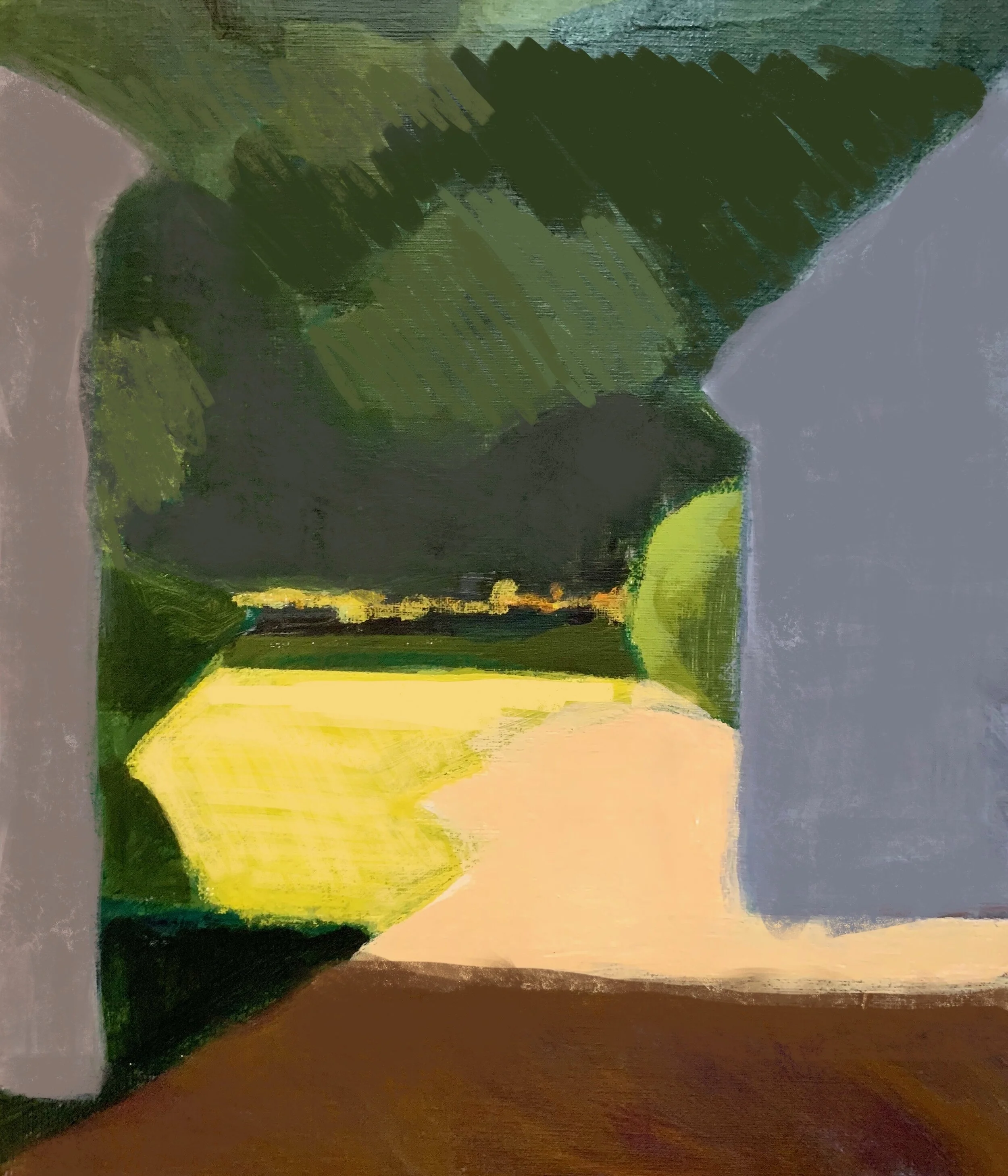
I began with this image as a reference:

IMG_5135.jpeg

Then in Procreate, I “painted” over many of the details
until I got the shapes the size and values I wanted.

IMG_0689.jpeg

It’s a lot more difficult to omit detail than to leave it in!
One of my favorite expressions:
”It’s a painting! Not a police report! “


A Bit of Abstract


This month we are exploring different kinds of abstraction
in the MDN class.
It’s inspiring and certainly a stretch for me.
I had a fun time with this experiment this week.

IMG_6466.jpeg

Untitled as of Now
10 x 6 oil on board

I’d done this earlier this summer and used it as a reference.

IMG_5338.jpeg


My intention was to remove details, similar sized shapes,
and concentrate on combining values.
I did this crazy thing quickly on my I pad
over the image of the above painting.

IMG_0686.jpeg

That was such a surprise, I used it as my reference
to paint over an old painting.
I just kept making subtle changes in color and value.
At one point I realized I had to crop it
to get rid of the same size shapes!
(Thanks MDN).

Here it is again.
Title ideas anyone?


IMG_6466.jpeg
 

Keeping Things Simple


The long hazy, hot, and humid days of summer are here
and it feels like everyone has slowed way down;
taking time to enjoy some of the simpler things.
I, for one, am getting inspired by paintng simple summer subjects.

IMG_6369.jpeg

Blue Chair

16 x 16 acrylic

I just love the simple lines of this chair and I used “made up” colors.
It’s almost a relief to have no committments or deadlines for paintings.
Summer is a time to reflect, relax, and recharge your batteries!

Enjoy!


Therapy Paintings


Having few opportunities to buckle down in the studio these days
I’ve had some fun doing some quick simplified beach scenes.
(It’s summer time!)

IMG_6362.jpeg

“Socially Distant”
10 x 10 oil on carton board

I find the act of breaking every thing down into
simple shapes of flat color is very therapeutic.
Almost like a doing a “coloring book.”
I’m guessing we all need a little of that right now.
No?

NOTE:
I’m getting ready to (hopefully) teach again in the fall,
and it’s been fun to re-visit my lesson plans.
As always, I realize that “getting back to basics”
is both comforting and re-energizing
for all of us.


My Old Boy Friend


Like many of artists, my “style” is always evolving.
I enjoy experimenting and exploring new approaches
so last week it was a challenge to revisit an “old boyfriend”
to do a commission.
A woman recently purchased this painting, done two years ago,
at Solace Studio and Gallery.

IMG_3302 (2).jpeg

”Beach Happy”
16 x 16

She had seen an image of one of my “beach chair” paintings
from that same series (that had sold)
and wanted a similar one “to go with it”; using the same pallet.
Using Procreate on my I Pad, I was able to “match” the colors
and experiment with various versions for her approval.

IMG_0674.jpeg

Here is the final piece and the client is thrilled.

IMG_6171.jpeg

“Summer School”
12 x 12 oil

It was great fun to hang out with my “old boy friend” to do this.
After so much experimenting with various approaches of “mark making”,
it was refreshing to go back to using large areas of flat solid colors on Carton board.

This approach works well for beach scenes, one of my favorite subjects.
And now that the beach is in full swing, I think I’ll do more!

NOTE: I’m not getting back together with my old boy friend.
We’re “just friends”.


Unfinished


Last week, during our MDN on-line class, he shared an image of
Charles Sheeler’s “Back Country Barns “ 1923
We were discussing mark making and
how impactful “unfinished” work can be;
as in leaving the sky white.
I was inspired to try it out. .

IMG_0675.jpeg

6 x 10
Gouache, pencil,
on mixed media board.

This was such fun to do,
as I have limited supplies and agility right now.

(Getting PT and will be “back” in the studio soon)

il_1588xN.2087237447_kxp1.jpeg
 

Summer Reading


While I try to keep this blog strictly about my painting journey,
I thought I’d share a bit of my “other” passion; reading!
While taking the time to slow down and heal my back,
I’ve been losing myself in some terrific new novels
and these a few of my latest favorites.

81yefJ806SL._AC_UY436_QL65_.jpeg

“A Good Neighborhood asks big questions about life in America today—what does it mean to be a good neighbor? How do we live alongside each other when we don't see eye to eye?—as it explores the effects of class, race, and heartrending love in a story that’s as provocative as it is powerful.”

71+K3uJwN3L._AC_UY436_QL65_.jpeg

“In this captivating story of crisis and survival, Emily St. John Mandel takes readers through often hidden landscapes: campgrounds for the near-homeless, underground electronica clubs, the business of international shipping, service in luxury hotels, and life in a federal prison. Rife with unexpected beauty, The Glass Hotel is a captivating portrait of greed and guilt, love and delusion, ghosts and unintended consequences, and the infinite ways we search for meaning in our lives.”

913kYJFkRrL._AC_UY436_QL65_.jpeg

“Afterlife is a compact, nimble, and sharply droll novel. Set in this political moment of tribalism and distrust, it asks: What do we owe those in crisis in our families, including—maybe especially—members of our human family? How do we live in a broken world without losing faith in one another or ourselves? And how do we stay true to those glorious souls we have lost?”

Each one of these wonderful “reads” touches on one or more
of the current societal issues that so many of us are facing today;
thought provoking and immensly fullfilling.

HAPPY READING!


Art in Situ


It’s always a treat to see my art work
hanging in someone’s home.
I recently saw this in a friend’s powder room
and it brough back so many memories.

IMG_5833 (1).jpeg

“Off Season”
7 x 9 oil

I did this in 2006!
Most of my work was “alla prima” (done in one sitting) back then and
I was using the distressed wood frames that were very popular.
It’s so fun to see evidence of my art journey along the way,
and to know the owners have found joy in sharing it
over the years.

NOTE:
I’ve recently been diagnosed with a stress fracture on my spine,
brought on by heavy lifting (and not heeding the signals)
6 weeks of no lifting, twisting, bending!
It doesn’t look like I’ll be doing much serious painting for awhile
but I’ll be sure to keep you posted when I do.

Have a great summer everyone!


A Slow Return


Happily things are starting to open up, albeit very slowly.
I just dropped off two paintings at the
South Shore Art Center
for the opening of the delayed Spring Show “Beholden”

They will be hanging the actual show that will be open “live”
to the public on June 11!

IMG_4928.jpeg

Spring Fireworks
12 x 12 oil

IMG_5027.jpeg

“Spring Wake Up”
16 x 16 acrylic

The plan is to allow limited numbers of people (wearing masks)
into the gallery at a time.

NOTE:
Tha annual Arts Festival has been cancelled this year
however, the art show will be available on line
June 12, 13, 14.

I don’t think any of us wlll be taking any of these wonderful,
traditional, events for granted ever again!


Virtual Information


The amount of information for artists that is currently available
on the internet is almost overwhelming.
I’ve been trying to limit myself (in order to stay sane) however this week,
I signed up for a virtual painting demo by Maggie Siner
hosted by Warehouse 521 in Nashville.  

Screen Shot 2020-05-29 at 6.26.54 PM.png

I’ve been fascinated by her work for years, so it was enlightening to watch her paint.
She is an excellent instructor; honest, generous, and funny.

I was inspired to set up a simple still life
and try some of her approaches.

IMG_5853 (1).jpeg

She works on toned linen in oil and begins with a gestural
”defination of space”.

IMG_5854 (1).jpeg

She then applies paint one stroke at a time,
beginning with the background to establish the space.
She then relates that to all the other colors moving forward.

IMG_5855 (1).jpeg

Not my usual approach and I was uncomfortable most of the time.
(I stopped here so I could let it dry before I started making mud.)

I hope I never stop challenging myself to try new things,
and I encourage all artists to stretch themselves.

If not now, when?
It’s what keeps us humble, for sure!