Painting From Thumbnails


In my Modern Painting class this month,
we are talking about ways to make our paintings more
expressive and personal.
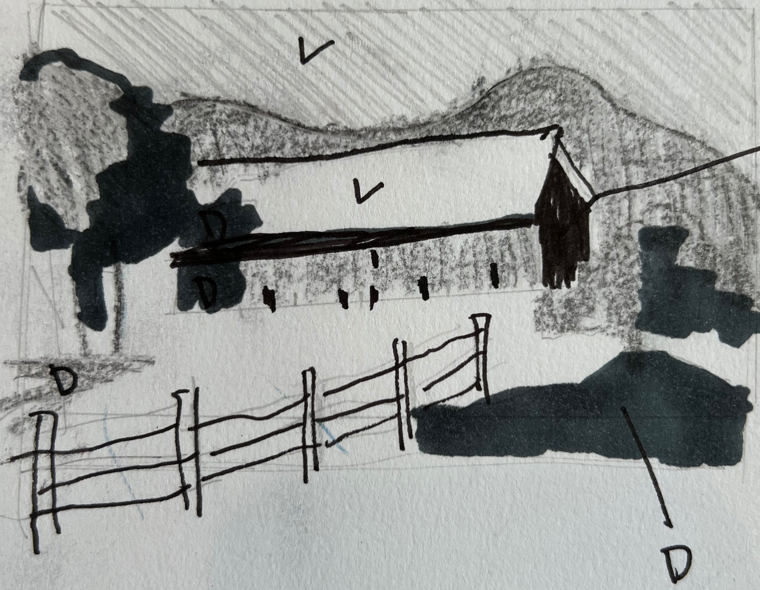
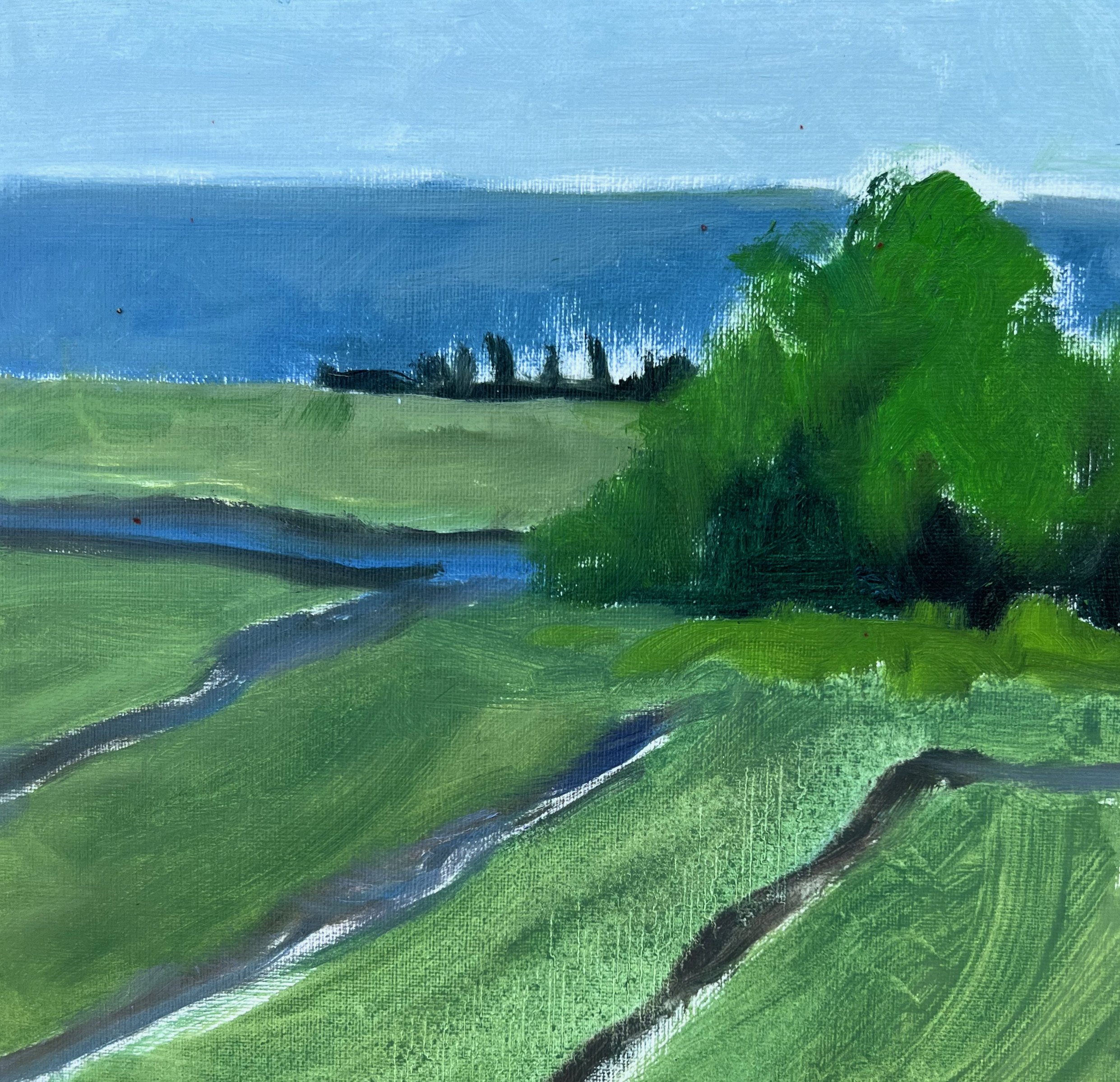
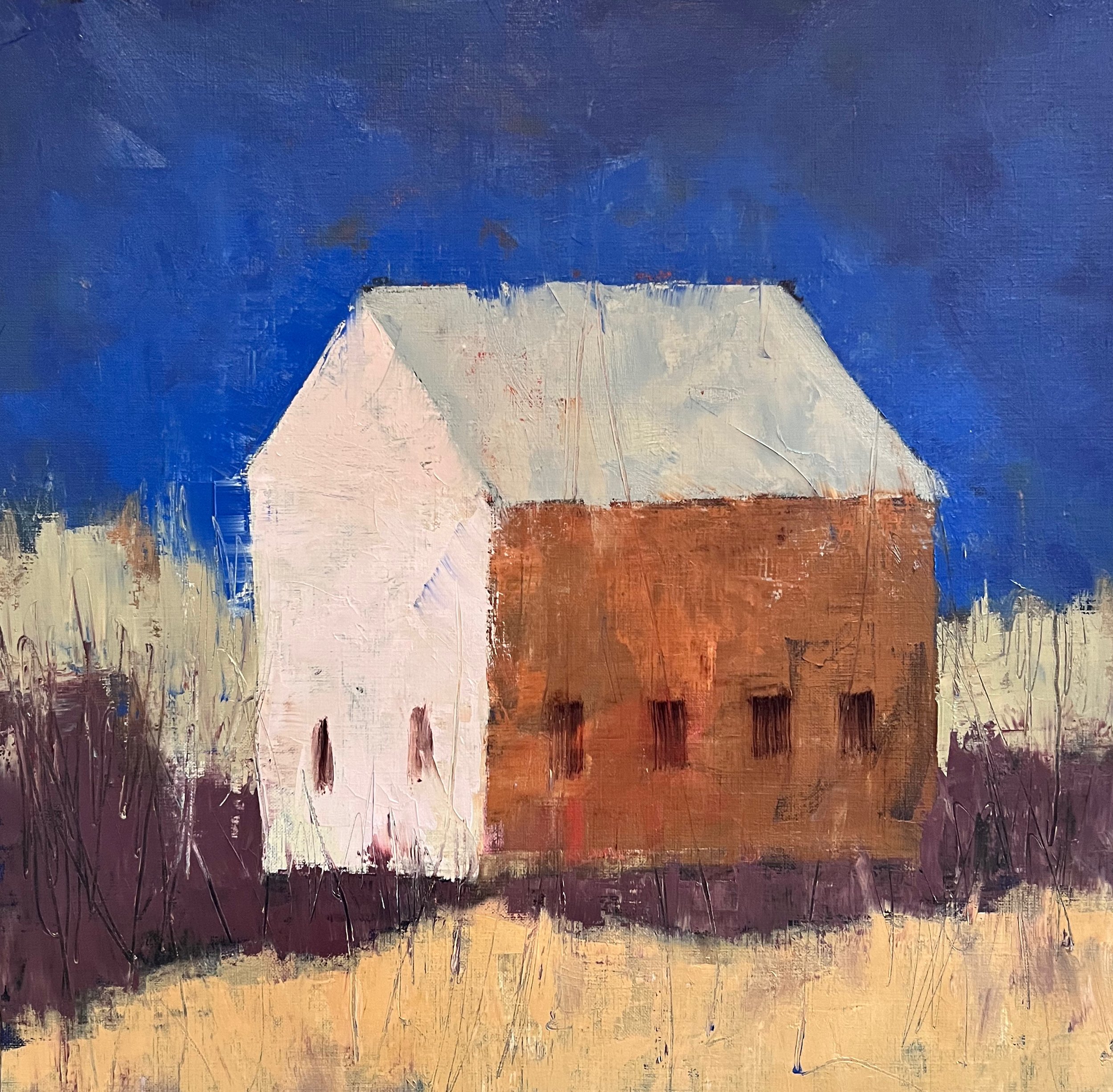
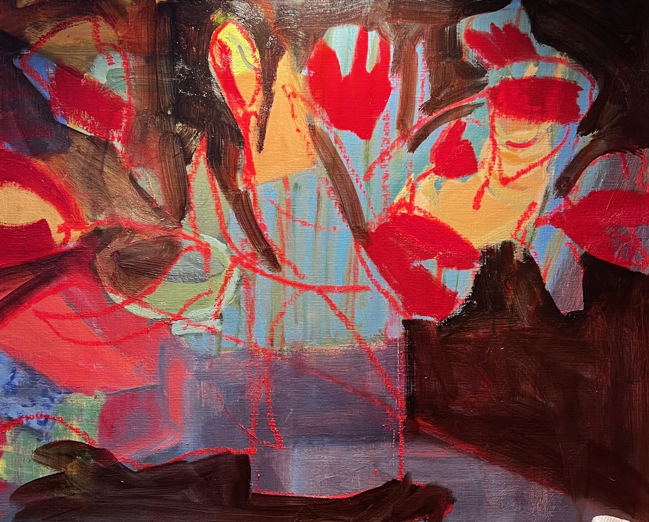
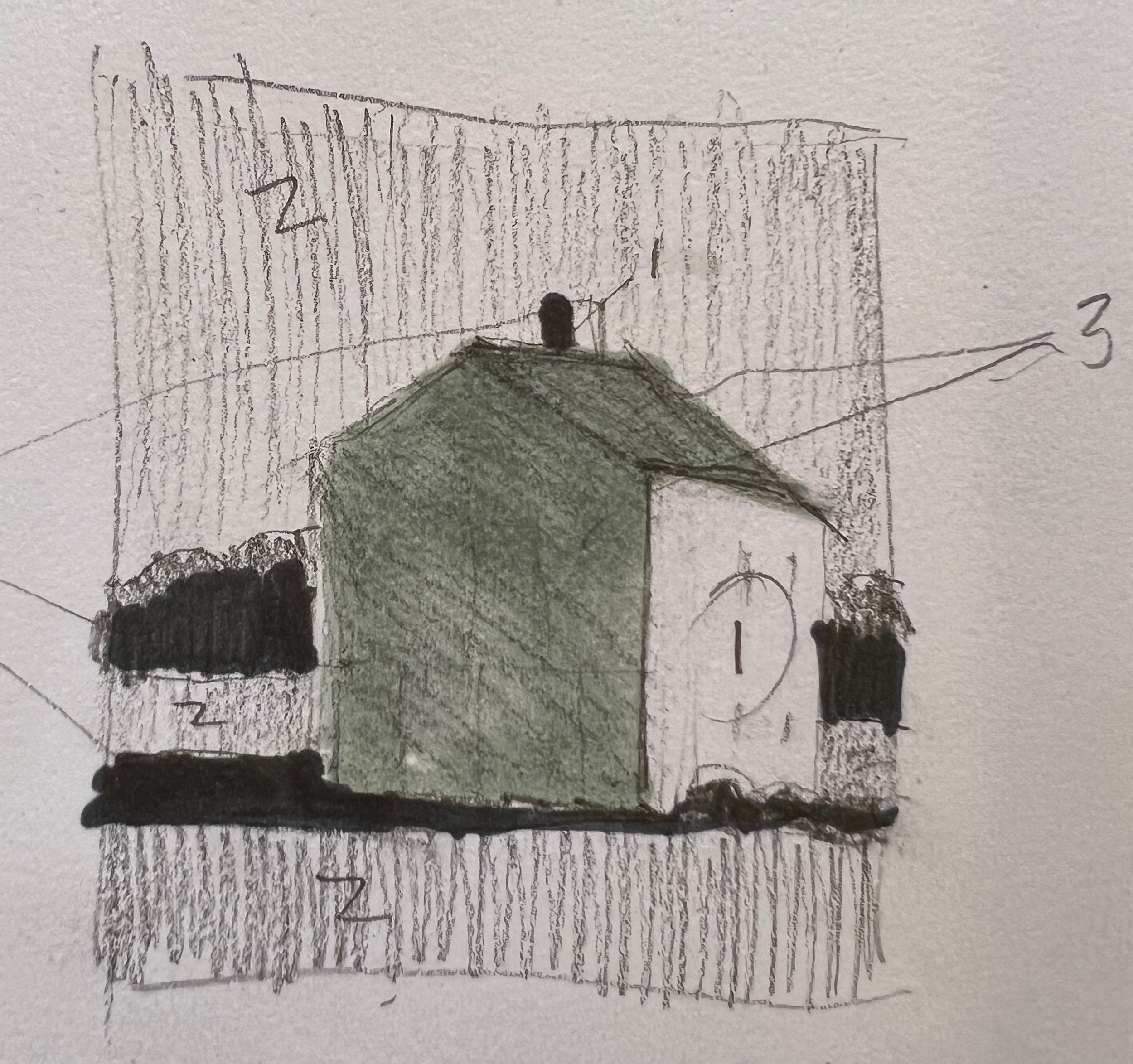
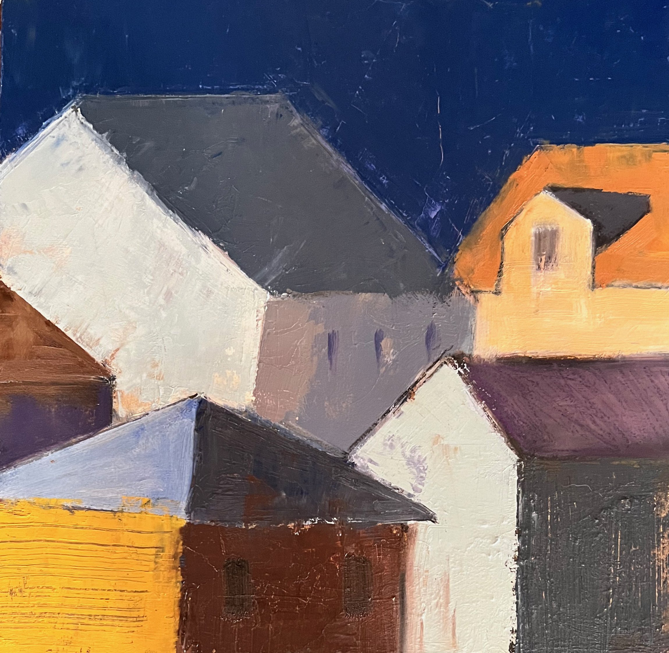
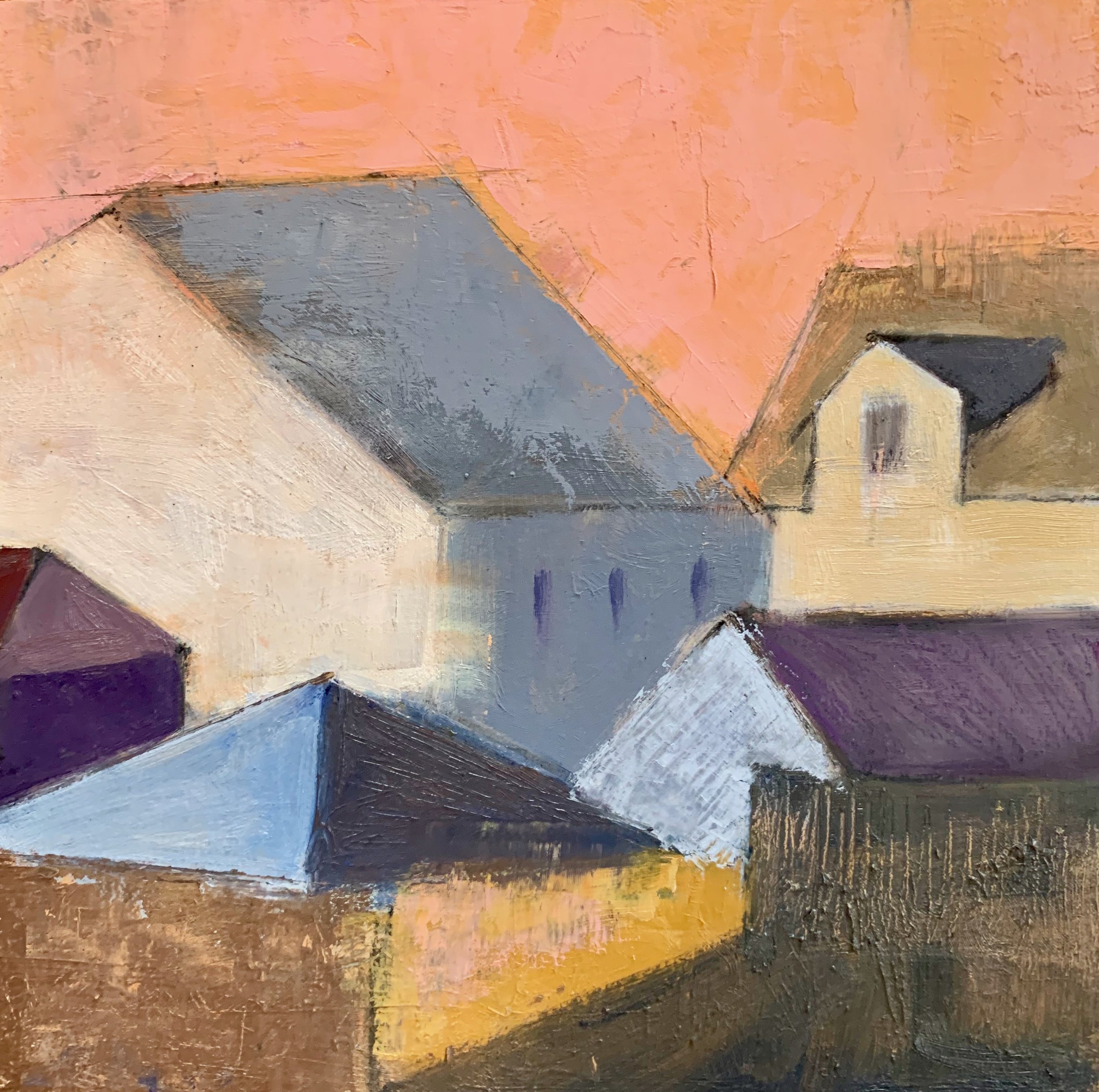
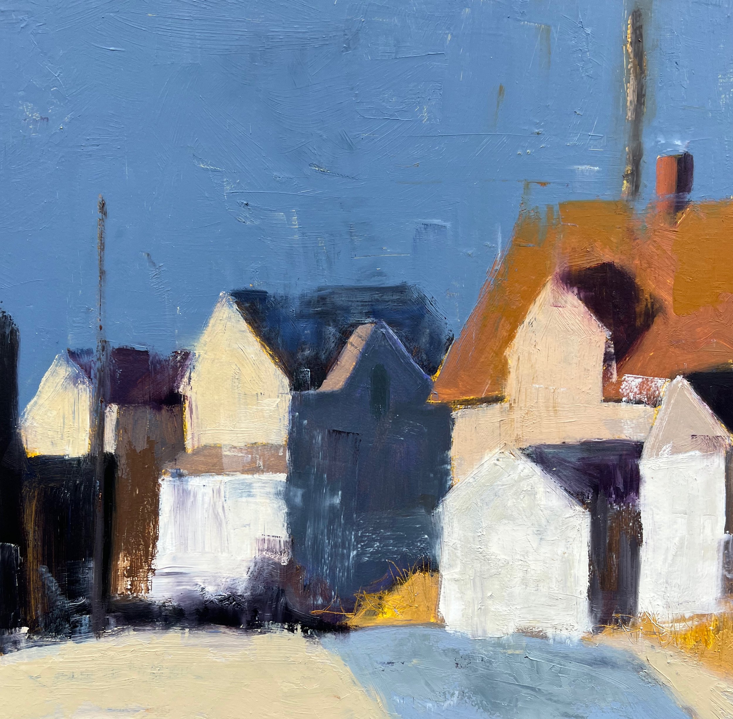
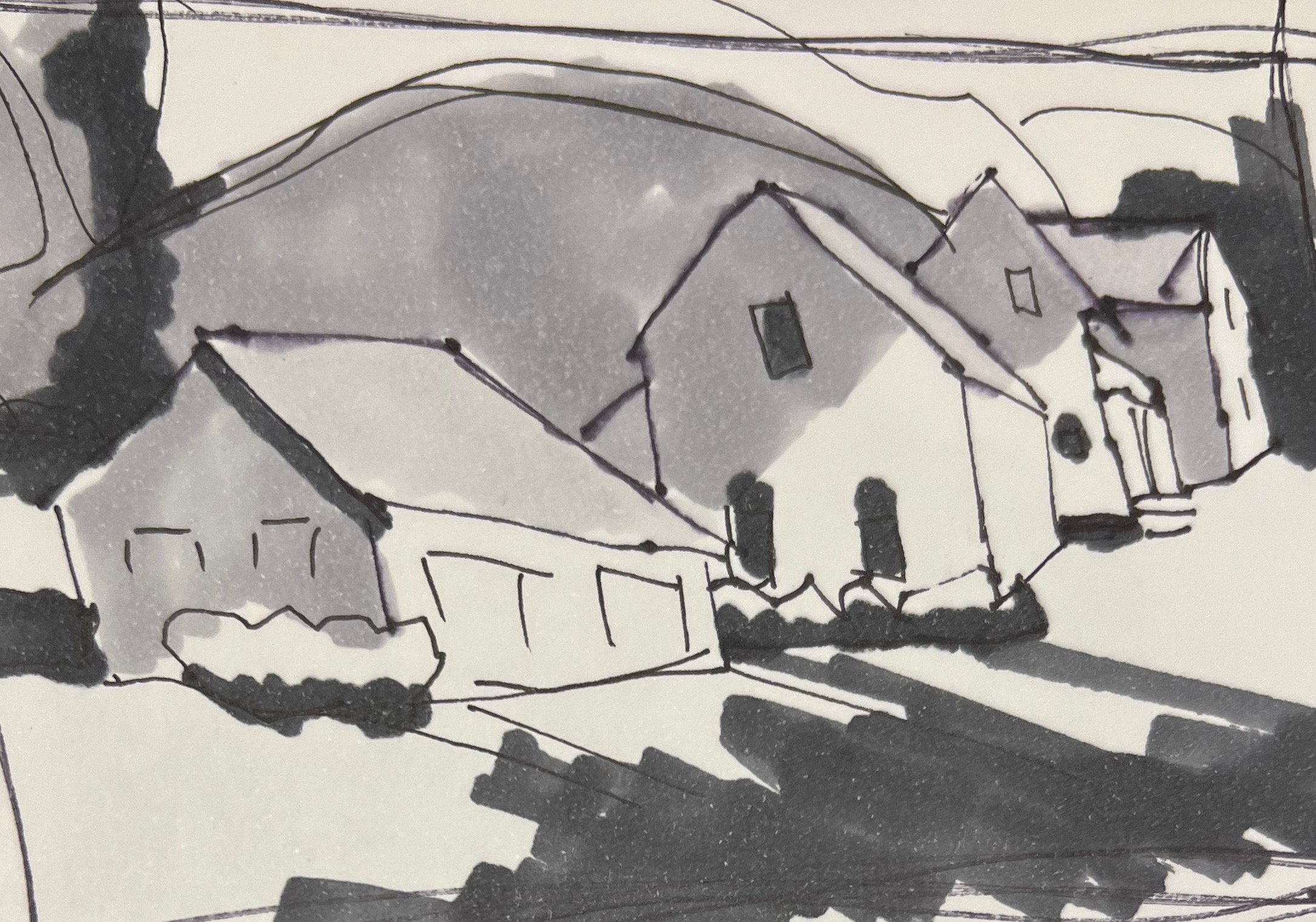
One way is to paint from a thumbnail value study
without referring to the actual subject or image.

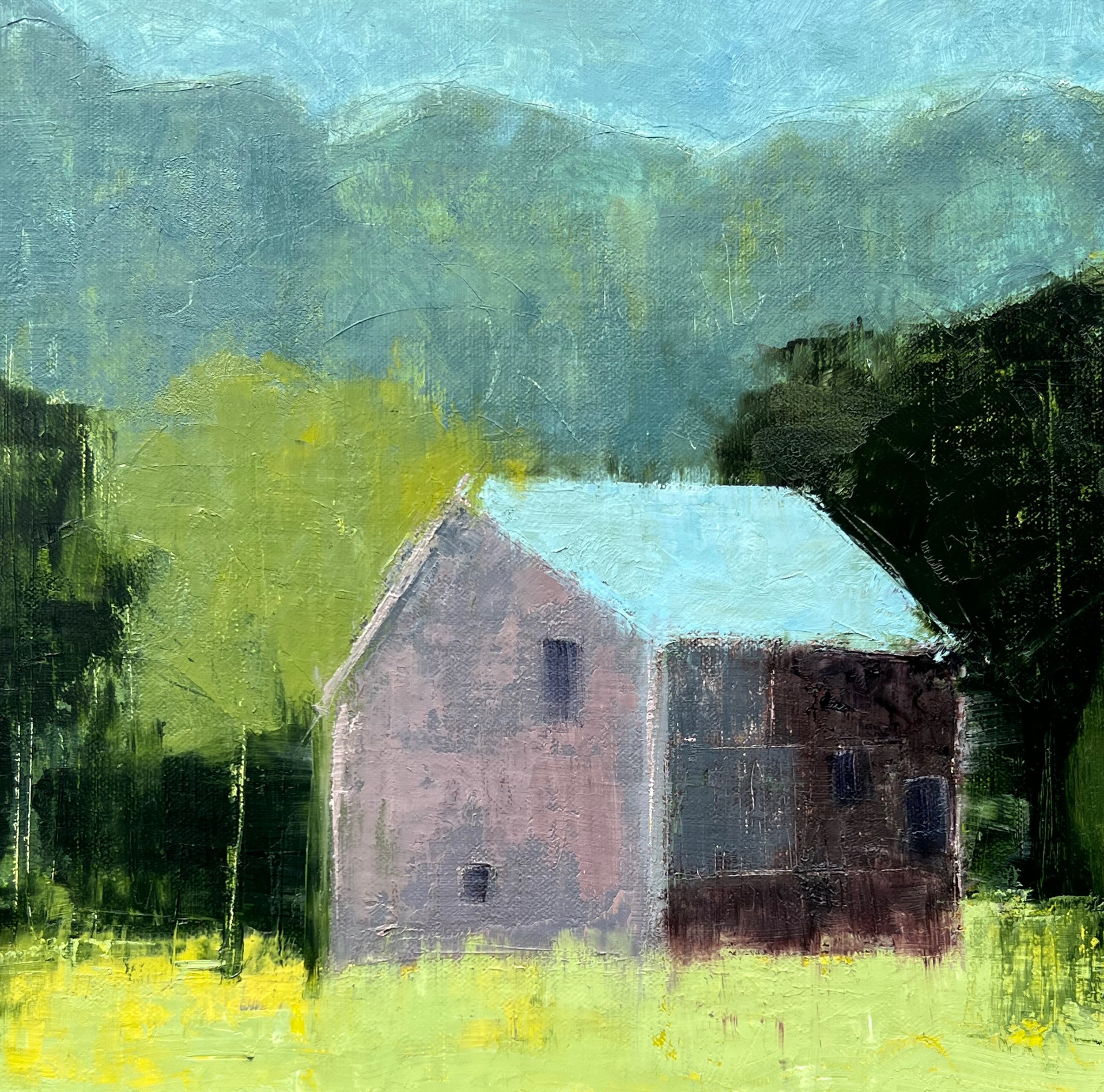
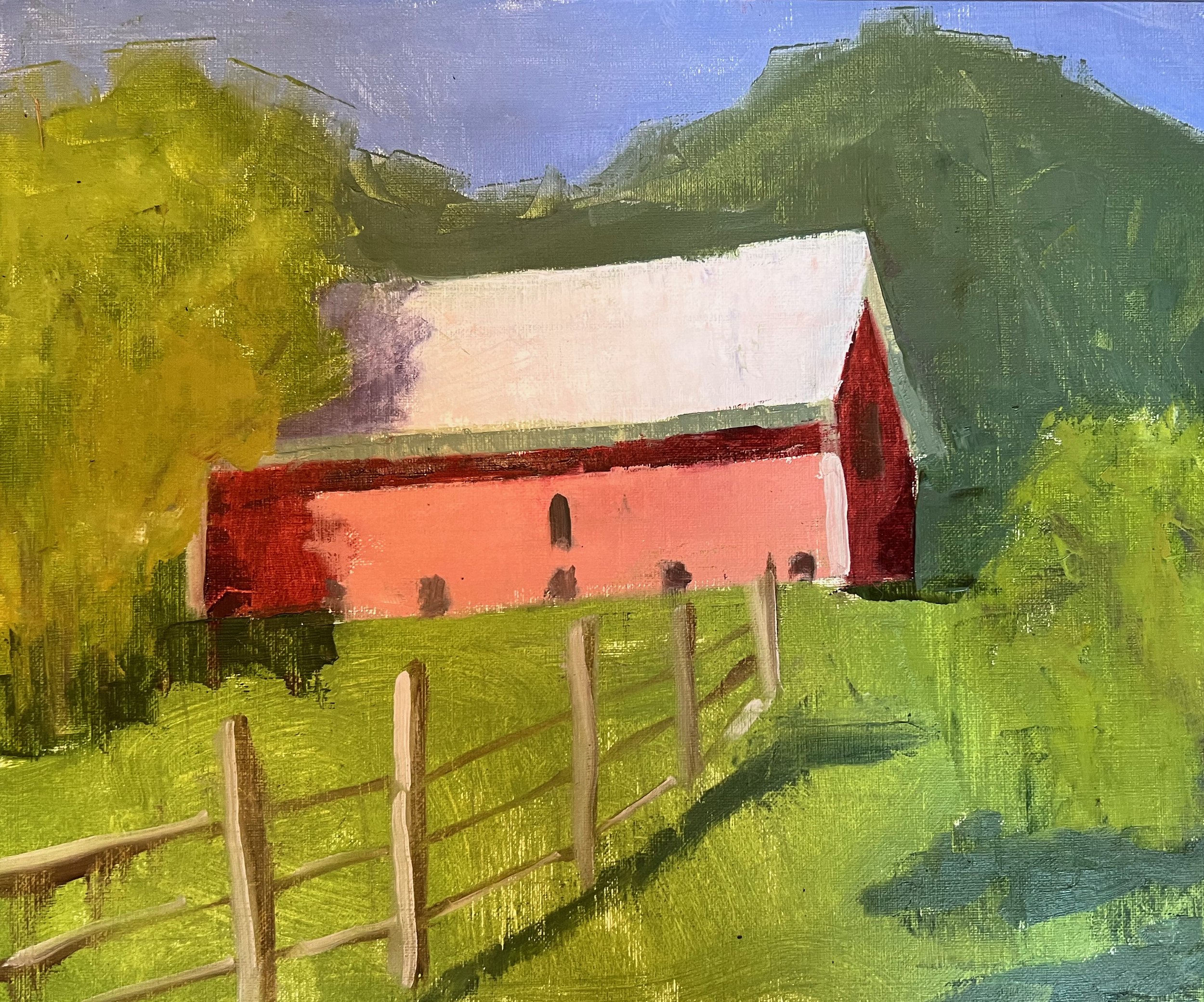
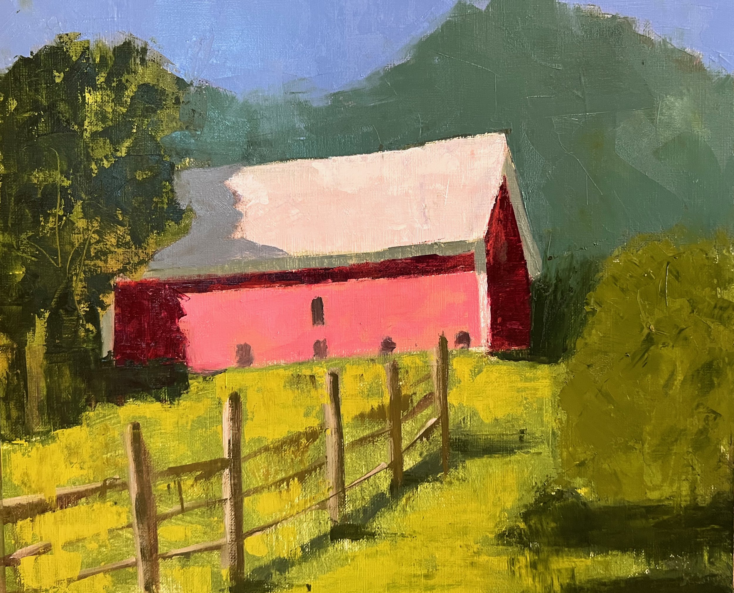
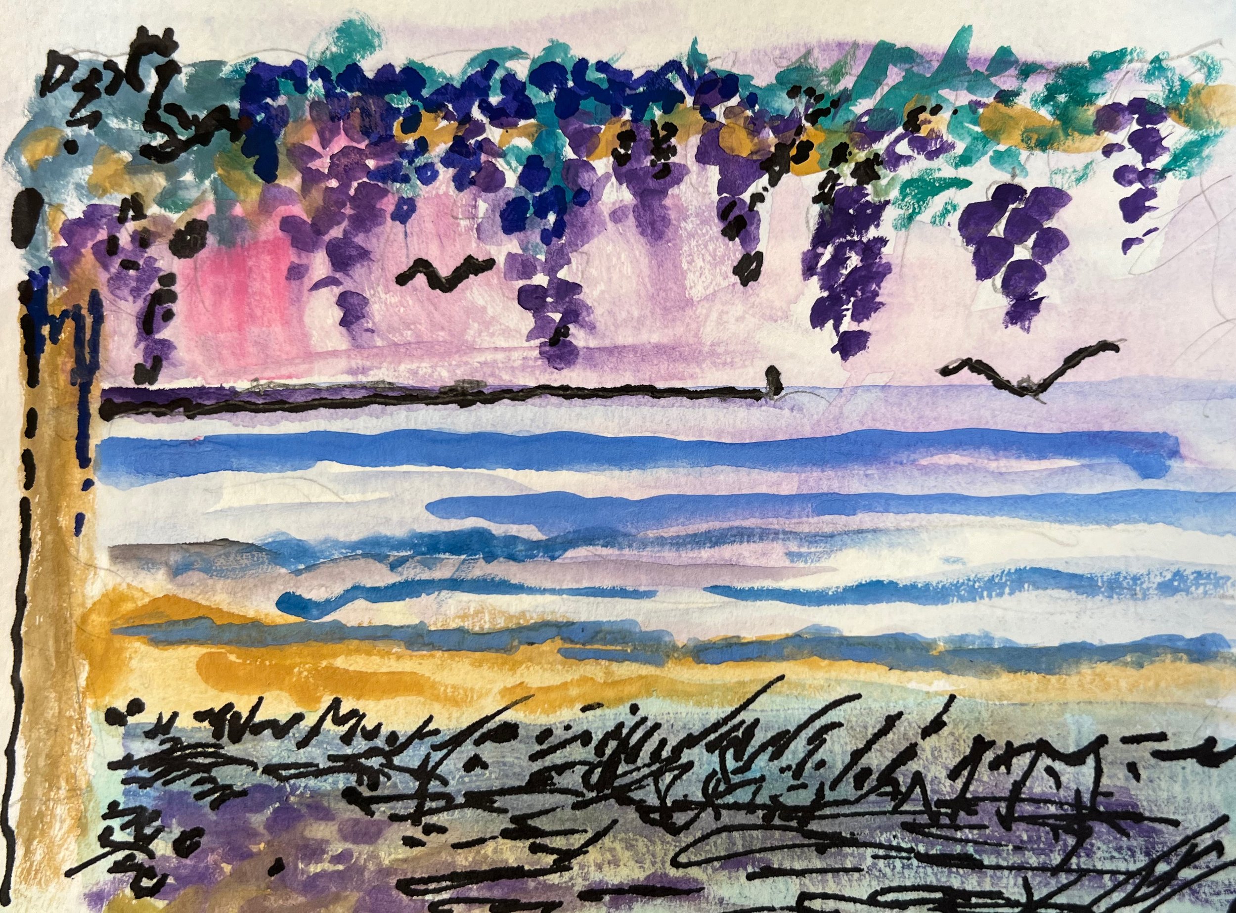
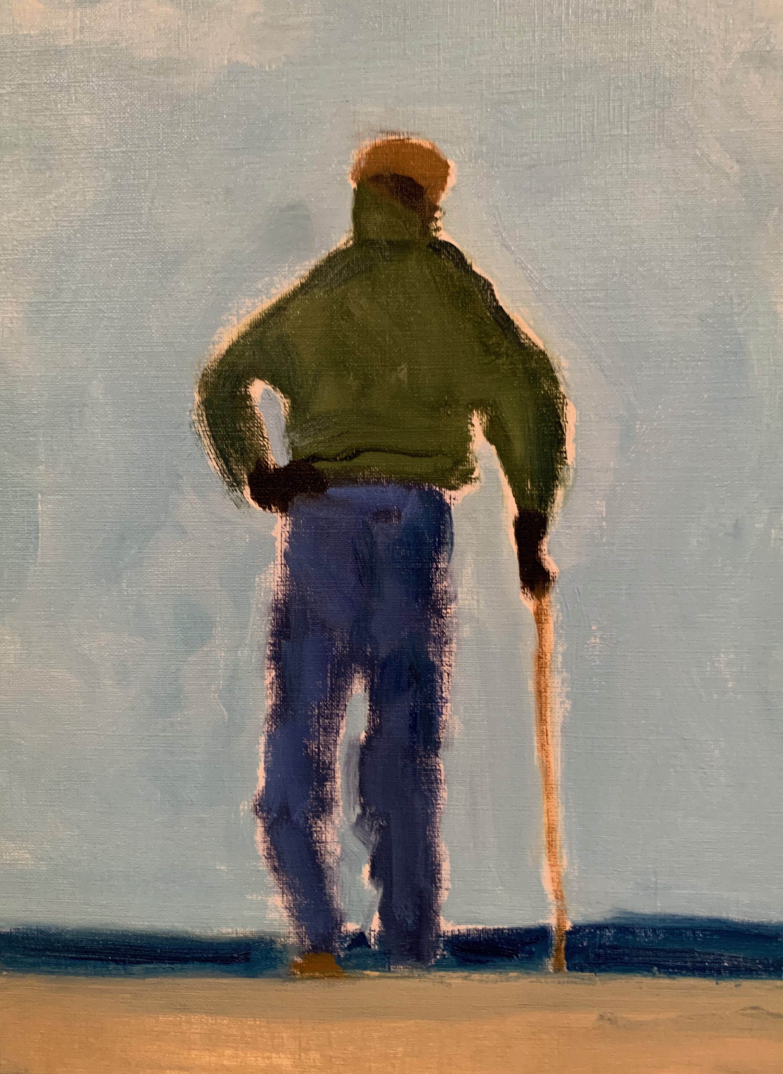
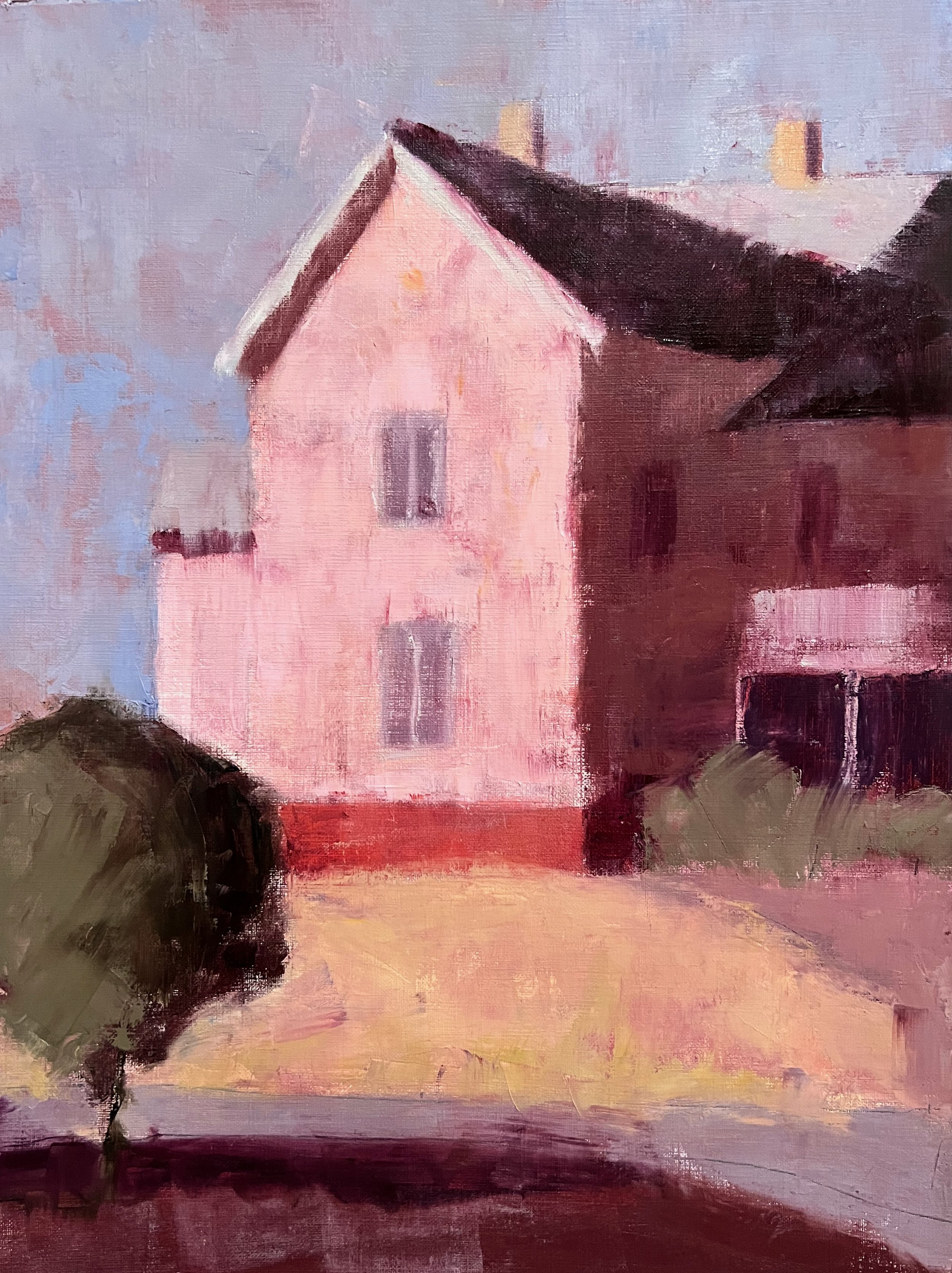
I had fun doing this 12 x 16 oil from a quick value study
I did up in Vermont in June.

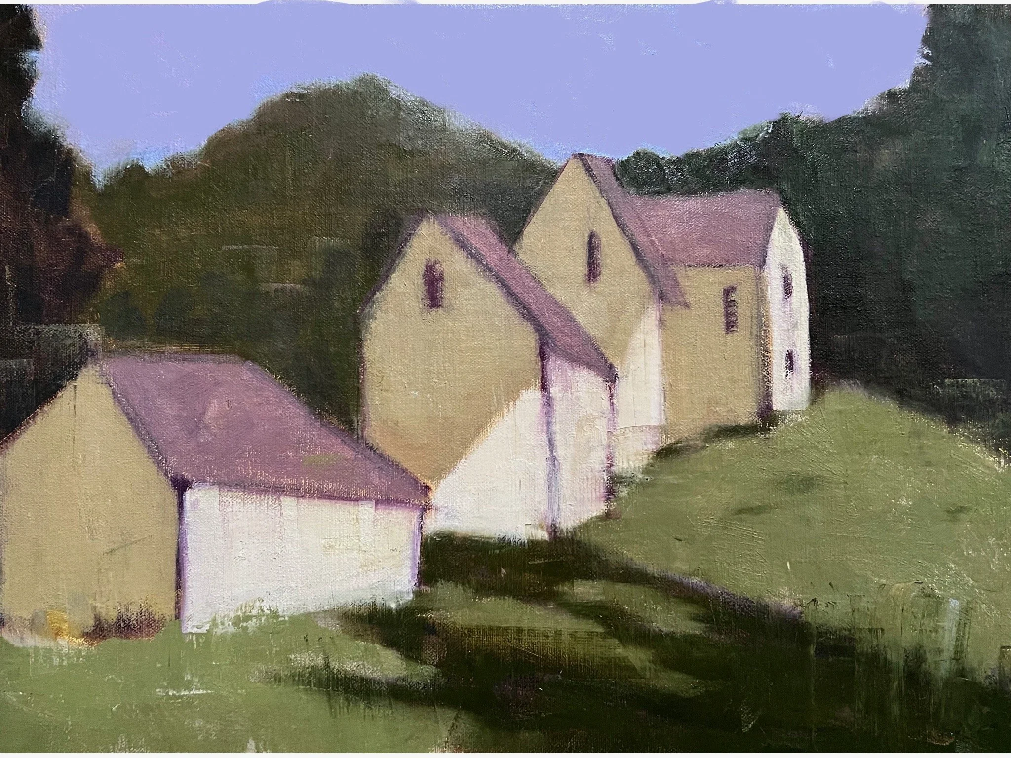
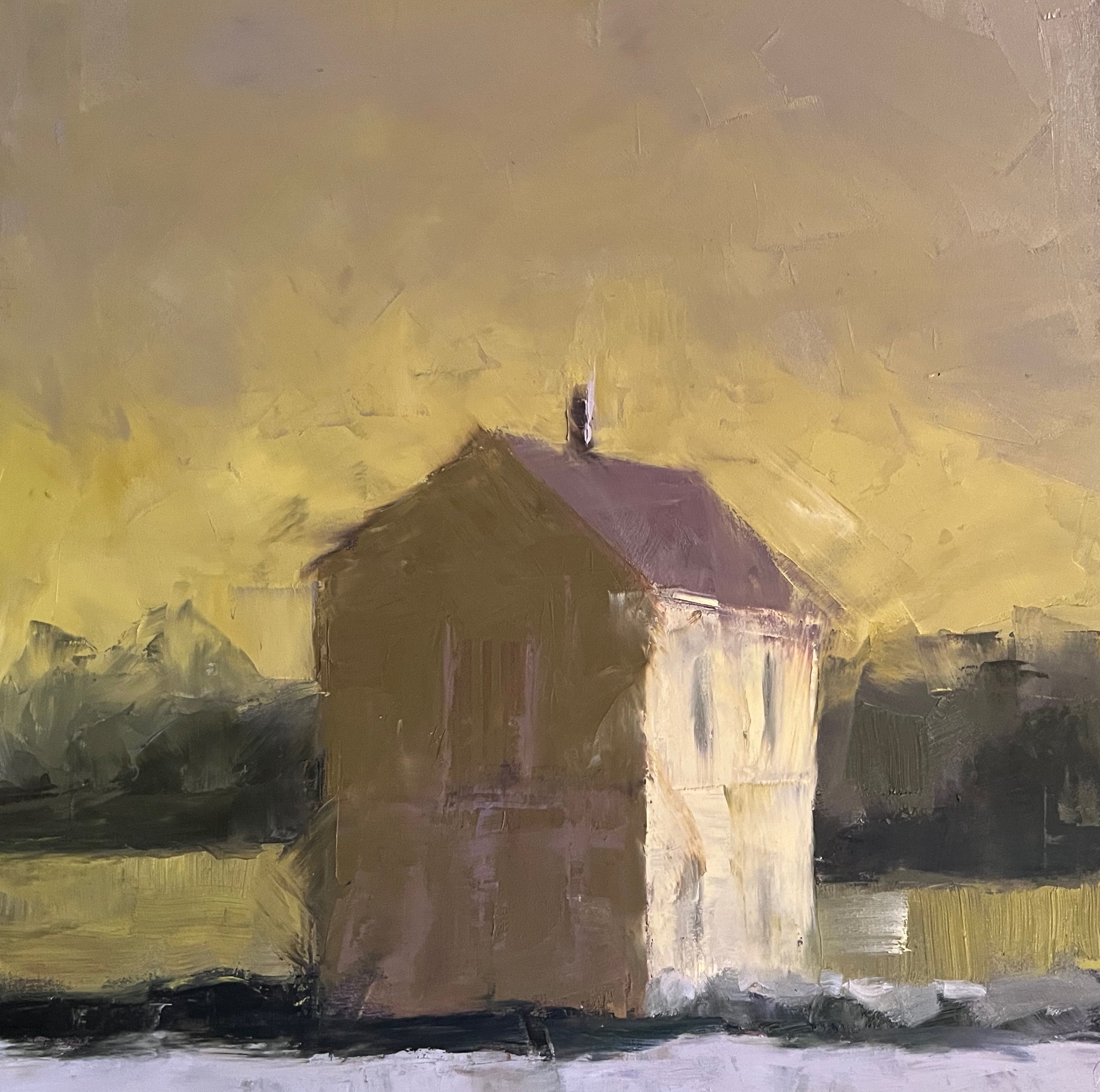
The fun thing about doing this is that you can make up a color scheme
while staying true to your value study.
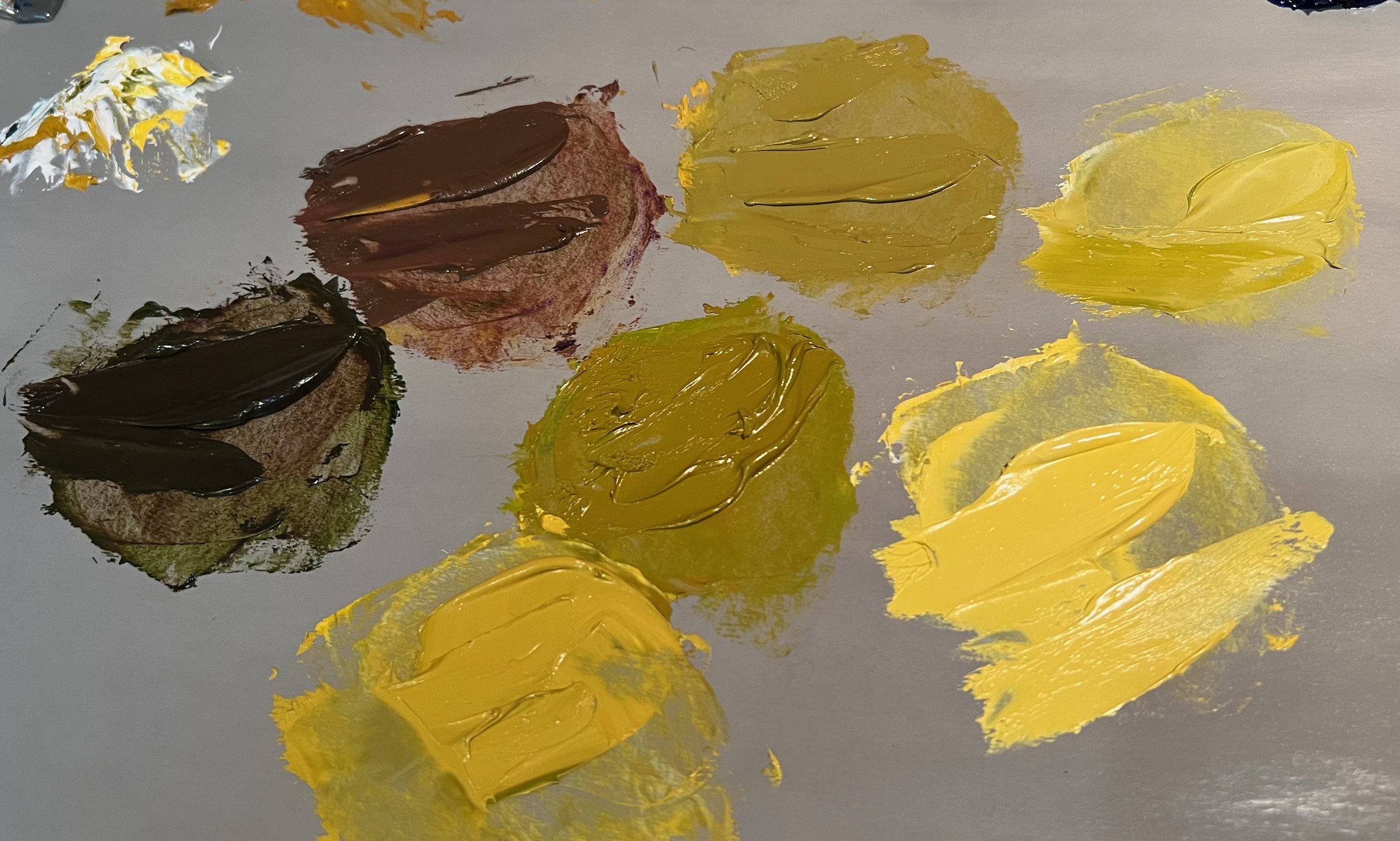
I started this one by limiting my pallet to
yellows, purples and bit of green.

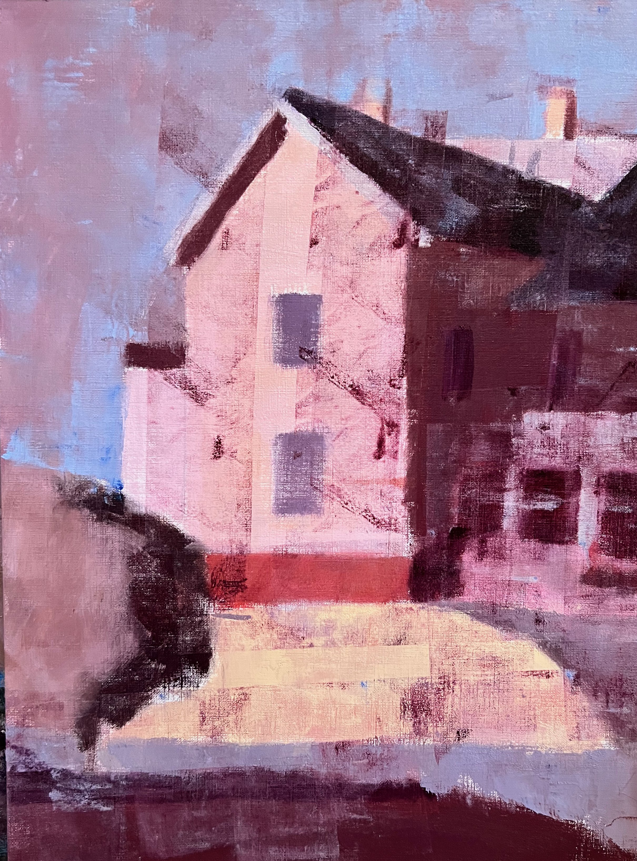
This is a fun challenge and once you get going,
you really can let the painting tell you where to go.
(I ended up darkened the back foliage and added more green)
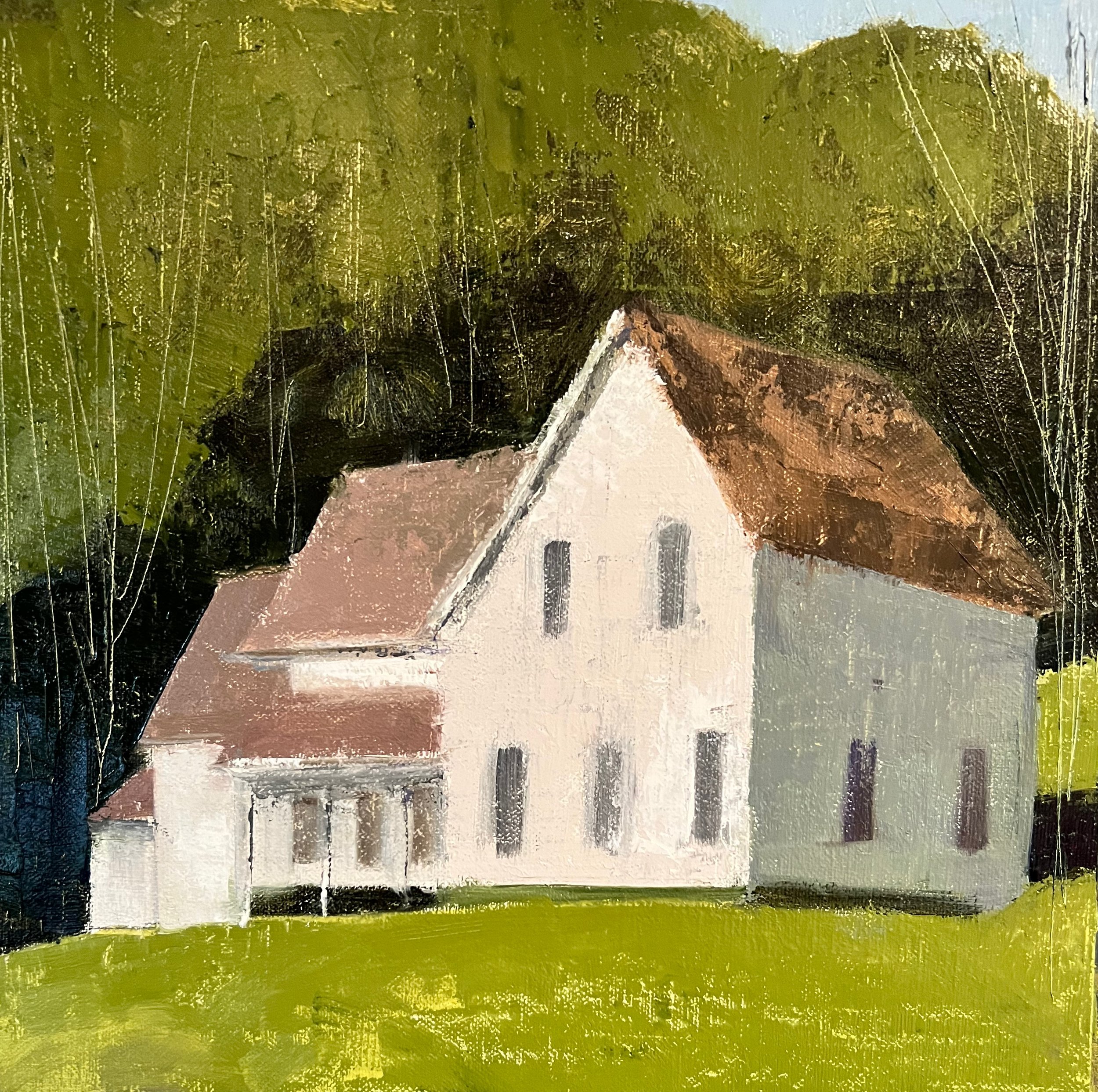
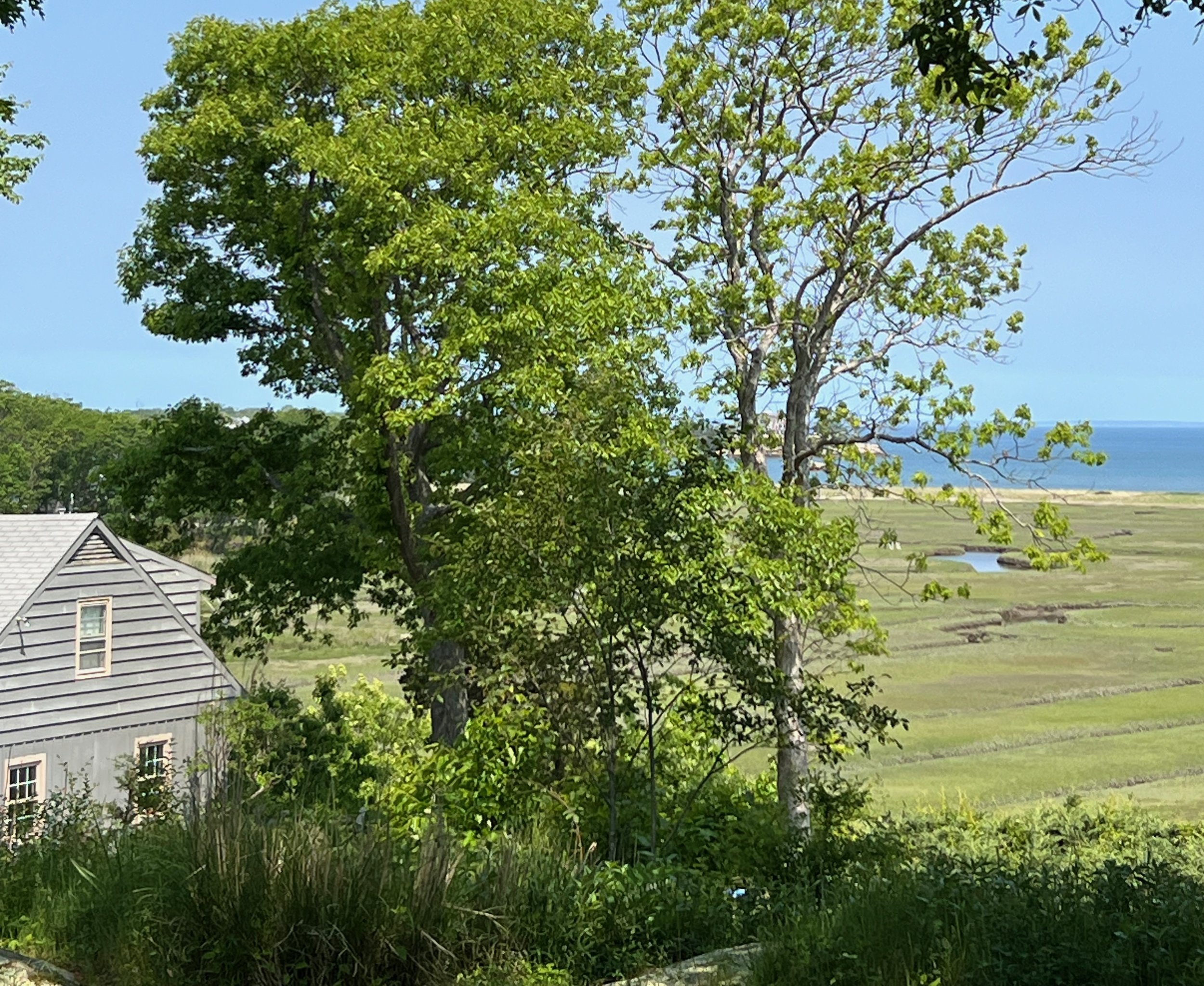
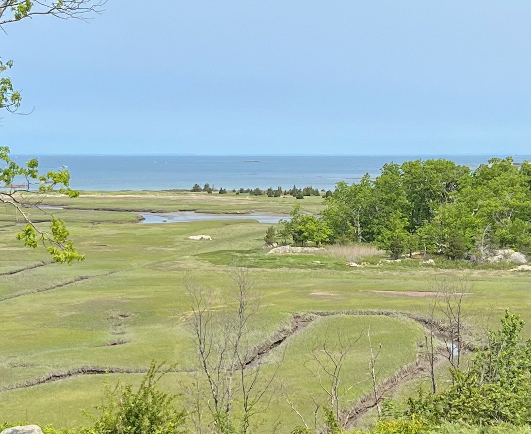
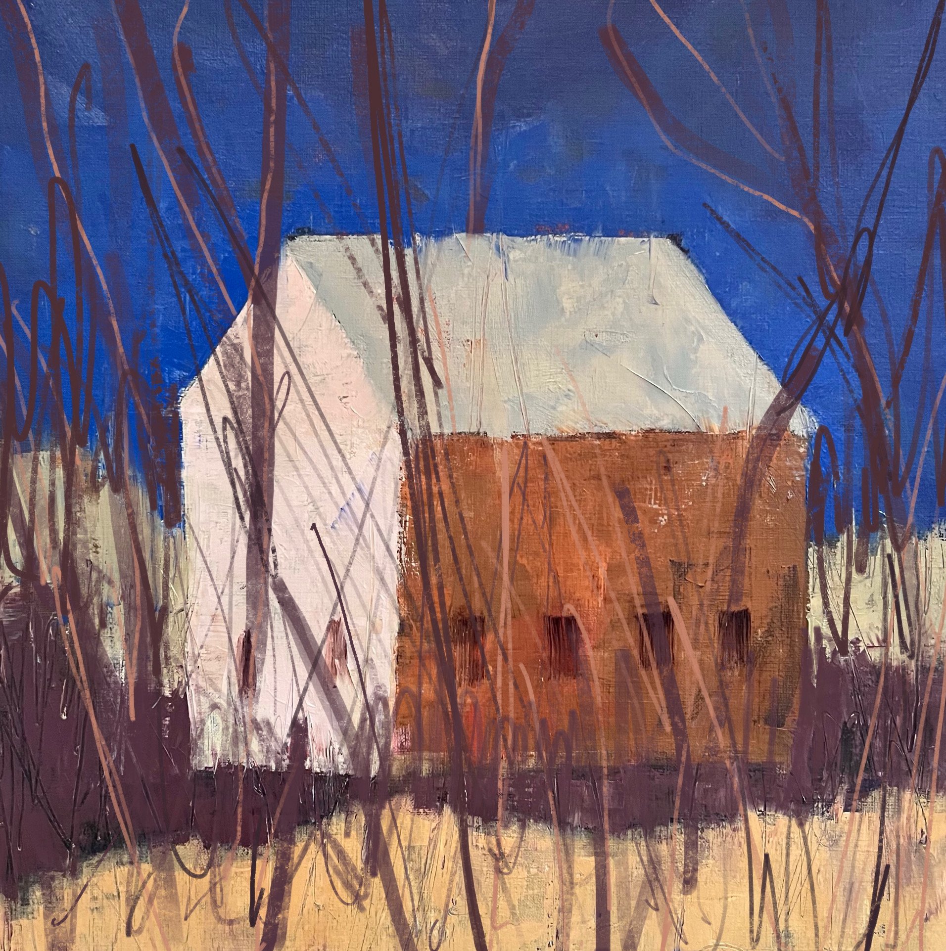
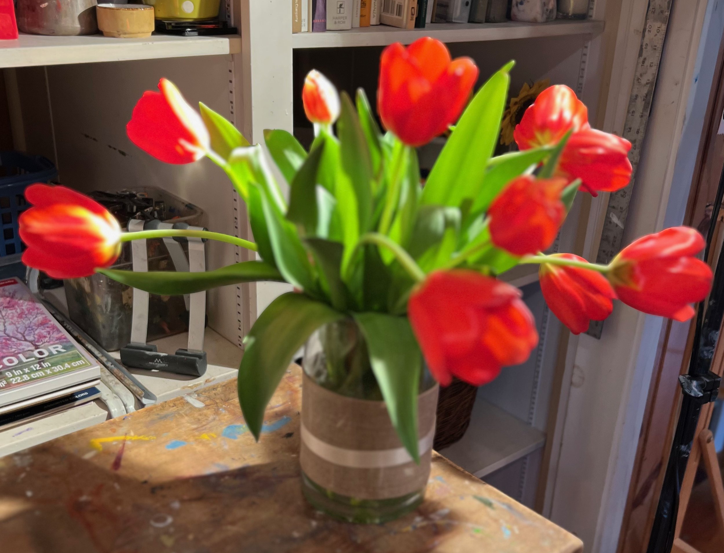
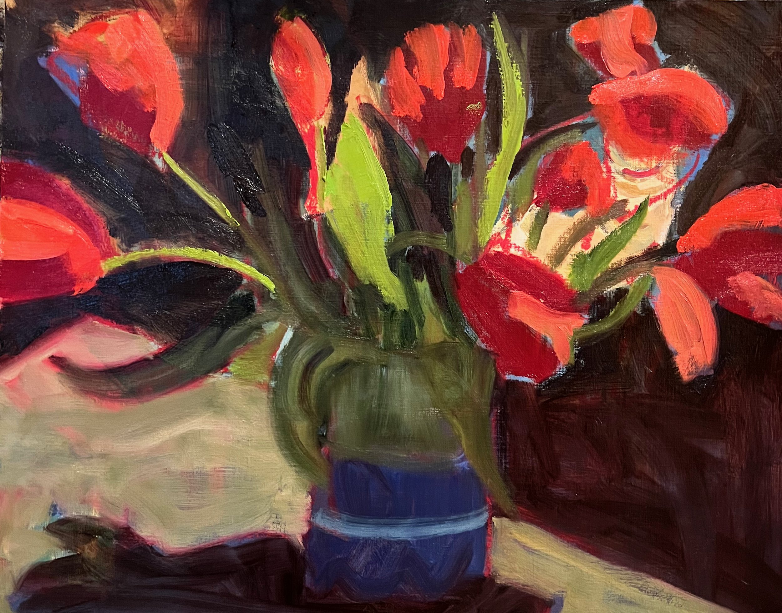
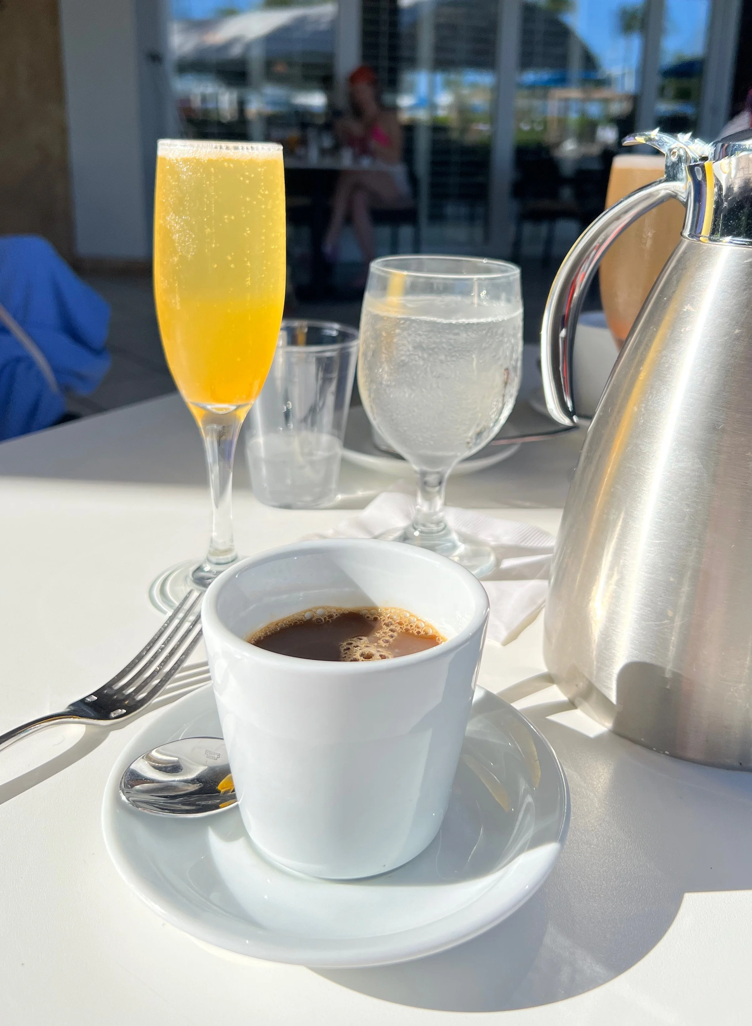
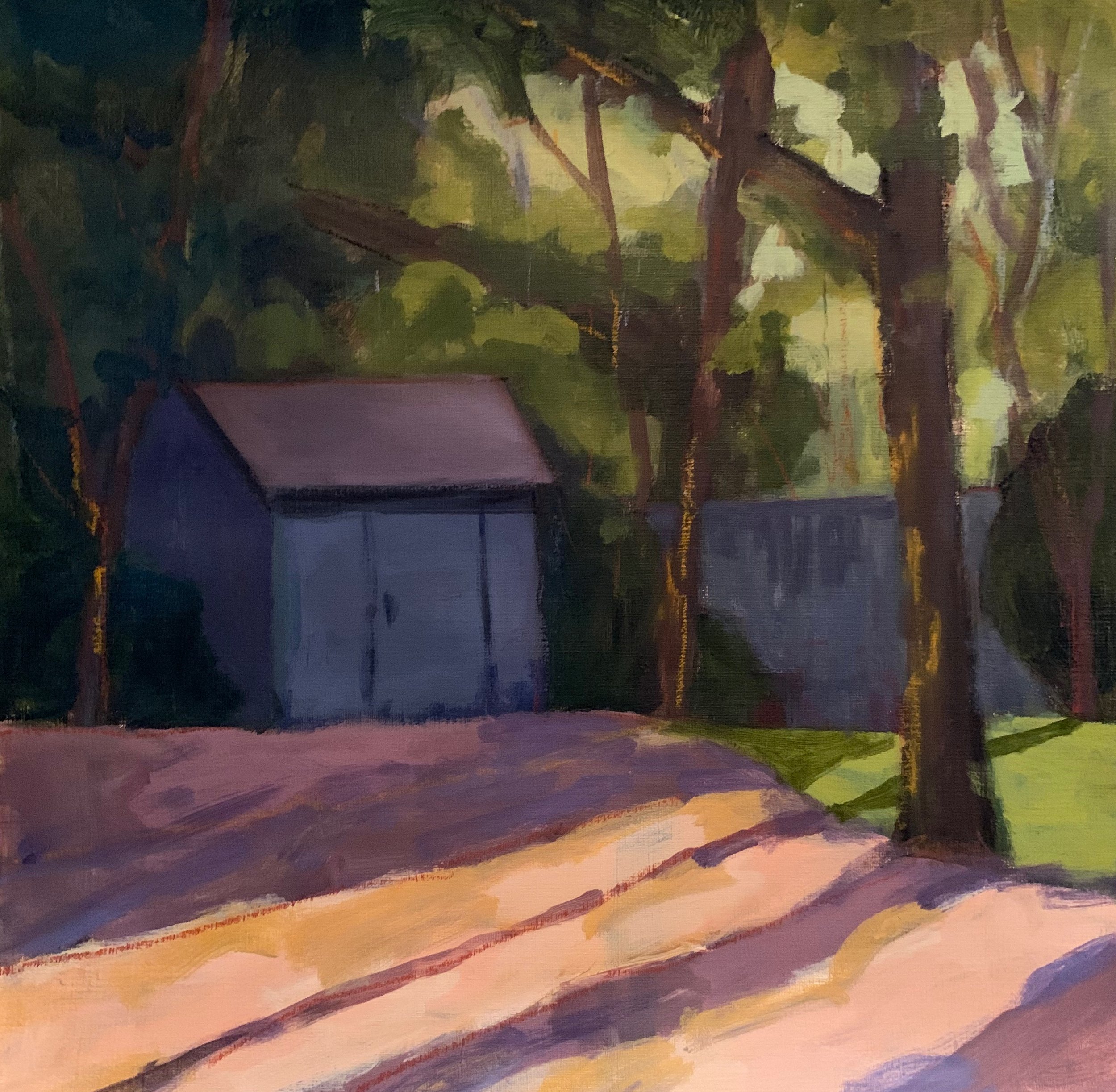
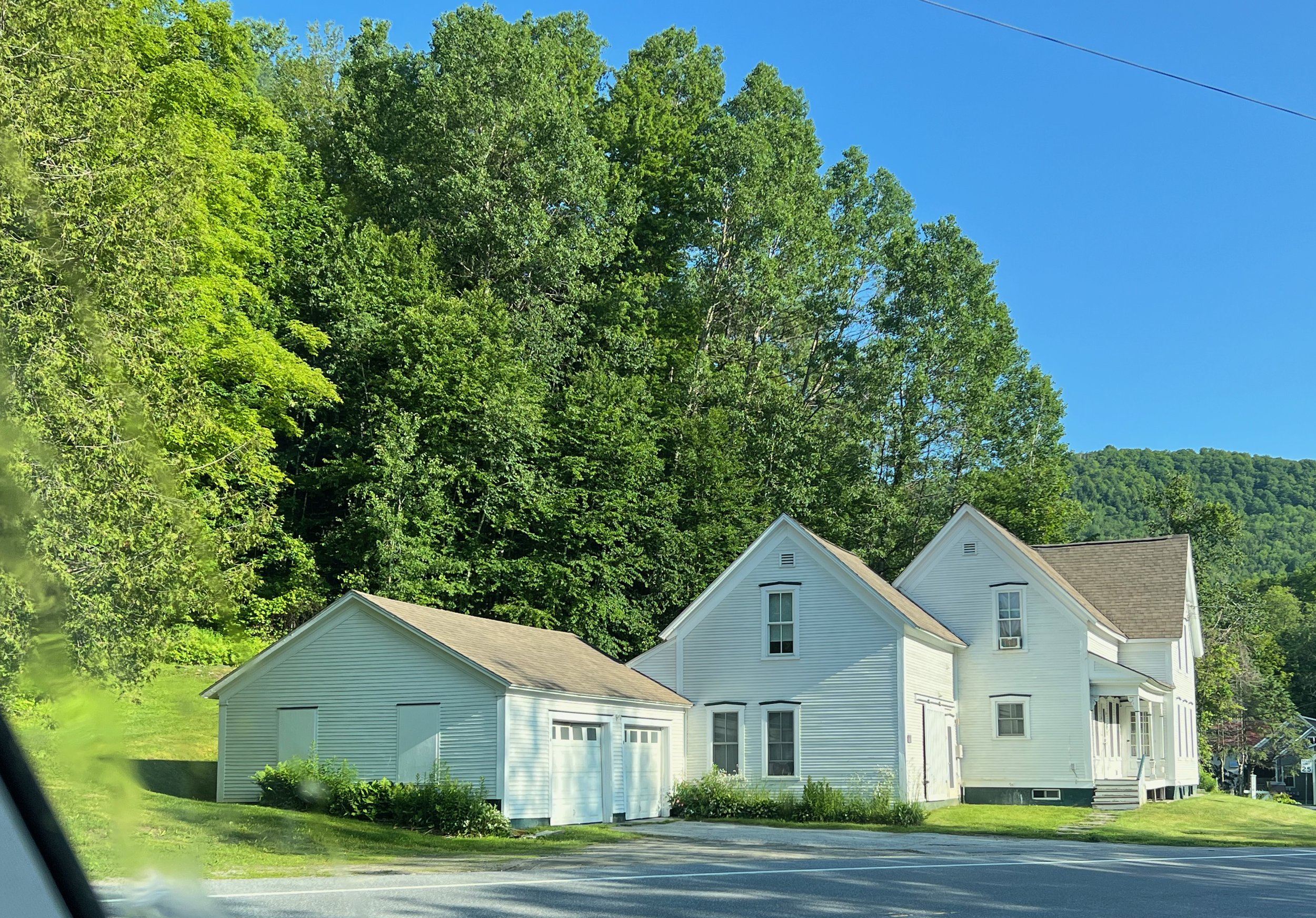
Here’s the image of the subject that I took from my car.

This is why I love teaching.
I need to practice what I preach!


Wabi Sabi


I recently went to a wonderful talk on Wabi Sabi;
the Japanese aesthetic
appreciating beauty that is
"imperfect, impermanent, and incomplete" in nature.

Blue Towel 16 x 16 oil

I realized how this concept applies to painting.
It’s a real challenge to let go of “perfection” and
allow a painting to be unfinished and unexpected!
That’s the fun of it all.


Warm and Blue/Grey Summer


Over this rainy weekend I got to spend more time
re-visiting some references from my week in Vermont.
As you can tell, I’m particularly intrigued by
the barns and how they sit so isolated and quietly in the landscape.

Blue Summer
10 x 10 oil on linen

As the afternoon progressed, this took on a blue /grey feel;
kind of like the weather we are having this summer.
It’s amazing how much that affects everything!


My Heart is with Vermont


My heart is breaking
for all those impacted by the
flooding in Vermont this week.
My thoughts were with them
today while I painted this.
(May not be finished)

“Thinking Vermont”
10 x 10 oil on linen
As a reference, I used one of the many sketches I did while in Vermont for a glorious week in June
for a Tracy Everly workshop.

I’m really looking forward
to time in the studio this summer
to explore and re-visit some of the
subject matter, images, sketches, and notes
from the workshop.

Stay strong Vermont!


Quick Value Studies


I just returned from a wonderful three day
plein air workshop in Warren, Vermont
with Tracy Everly organized by the
Edgewater Gallery.
She did demos each day and
watching her paint was enlightening.
I was reminded of the importance of doing
quick value studies
before you begin, in order to organize your composition.

Just doing this much was enough to get started;
a difficult moment in plein air.
Light, middle, dark.

This is where I stopped when on location.
Just enough to get me to this in the studio.

It was heaven being away for a week,
learning new things and meeting new people.
Tracy is a generous and talented instructor
and I’m so excited to try out all my new “tools”.
Welcome summer!


What I'm Working On


Spring is such a busy time,
I’m always happy even if I just get a quick chance to paint.
I worked on this over a few quick sessions recently and think it may be done.
This is a favorite subject near me
and I wanted to capture that incredible
spring morning light.

“Spring in New England” 8 x 16 oil

First I did a value sketch using the image for a reference

Next session I blocked in the main values using a limited palette.
(Sap Green, Paynes grey Dark, cad yellow light, white)

Next session I added more paint and
played with the edges.

Then today I exaggerated the values and worked more on textures and may have overworked…

I’m taking a plein air workshop
up in Vermont next week
so I’m trying to fine tune my approach to
architecture in the landscape.
Wish me luck!


Plein Air Revisited


I joined a terrific group of artists
yesterday for some plein air painting.
It was my first time out in years
so it was a bit daunting.
This was my view!

I was using oils on canva paper, (not ideal)
a very limited pallet,
and gear I haven’t used in years.
It was a struggle and I was way out of my comfort zone but the good news
is I was out there!
Eeesh…my values were way off!

I was daunted by all those greens!
By the time I started a second one,
there was a smokey haze that softened everything.

I used the leftover paint to do this quick
8 x 8 oil sketch

I was reminded how challenging painting outdoors
can be, and yet how gratifying it is.
It was a bit of heaven.
I’m inspired and excited to explore more plein air opportunities this summer.
(I’m thinking of using toned canvas boards and
gouache or acrylics for more flexiblity outside!?)


"When something bad can be good ( and vice versa)"


I recently had five paintings rejected from a
local juried show.
After going through all the predictable reactions;
shock, anger, self doubt….
I was reminded of the Buddhist saying
”you never know when something bad could be good”
(and vice versa)
So I entered this favorite of “the rejects”
into another local Juried show.

“Roadside Attraction”
12 x 12 oil 


It was not only accepted,
it received the 2nd place award in oils.
So, I guess a positive attitude and faith in yourself
goes a long way.
Not to mention,
juried shows do not mean a thing
about your talent or personal journey!


Manipulating Color


Last week in Modern Painting we explored ways to manipulate color to make our paintings more
exciting and expressive;
specifically using limited pallets.
We worked on using:
a: complementary colors
b: one dominant color family
c: mostly neutrals with spots of vibrant color.
We used black and white images as references
so we had to make up the colors.
Below are a few examples of the work done:

Complementary colors; purple and yellows.

Dominant color family. (green)

Mostly neutrals surrounding pops of color.
It is so inspiring to be working with such talented
and enthusiastic artists.
And in person!


Back To School


We had our first Modern Painting class this week
at North River Arts Society and it was like the
first day back at school;
a wonderful reunion of old and new
like minded artists
ready to roll!
Here are just a few of the quick paintings done
from memory.
(I set up a small still life in another room where they could look at it as long as they wanted,
then return to paint it from memory.)

This gal decided to paint the view from her bedroom from memory!
Amazing.

As always, I am excited and inspired
by this great group of talented artists.
I look forward to seeing
what we all learn from each other.
Happy Painting!


More Barns


I’ve been having some fun
experimenting with more barns.

This one is abandoned and somewhat
hidden from the road.
I’m thinking about adding some branches and trees to further portray that sense of loneliness….
so I tried it out in Procreate.

I’ll keep you posted!


Mixed Media class


We had our first Mixed Media class
this week at Linden Ponds as part of their
Life Long Learning program.
We experimented with watercolors, pencils,
markers, colored pencils, and ink.
Here’s my quick demo.

I suggested they start with a light wash of watercolor,
then, when dry lightly draw their design in pencil.
Then color in the shapes with thicker
paint, marker, and/or colored pencil.
And finish by outlining everything with
a thin black line.
Here are a few samples of the work done:

This gal brought all kinds of dried items from the woods and just went to town. (wow)

This was done from an image on her phone.

This woman said she was thinking about
a grape arbor by the ocean.

This brave woman is visually and hearing impaired
and her work continually amazes me!

This woman has a tree in her apartment
that she decorates for all occasions year round.
She has a collection of antigue painted eggs that she
wants to show off so she is going to have a party
and use this for the invitation!

I am always so amazed and excited
to see what happens when people
come together to create!


Massing Shapes


Last week I re-worked a demo
I’d done for a class a few years ago
while discussing “massing shapes”;
the approach of simply massing in the large shapes
without any pre-drawing.

“Sea Wonderer”
12 x 9 oil
Here is the original demo,
showing no drawing, and no paint touching
other paint.

I think “massing shapes” is a
great way to start a painting.
It keeps things loose and helps
you focus on just the big shapes.
Then you can take it anywhere you want it to go!


Timed Exercises


In Tracy Everly’s last class she reminded us
how doing timed painting sessions
can really loosen things up and
create more spontaneous and intuitive work.

“Caroline’s Tulips”
16 x 20 oil

This was done over a few sessions
and here is the progression.
The subject:

I drew in the shapes with a red oil stick
over an old painting,
then started with the darks.

Here it is after 20 minutes
and it’s already begun to feel too fussy!

So here comes the fun part;
destruction!
I took a squeegee and some scrapers to it.

I loved what happened here, so I left most of it
and just re-worked the vase and defined a few of the leaves.
(see final result above)
Not sure it’s “finished” but the process was
enlightening.

This process prevents over thinking and therefore,
over working!
And the results can be unpredictable and exciting.


Contrast


I took another terrific class with Tracy Everly last week.
We talked about ways to draw attention to a
specific area of a painting by using contrasts;
dark/ light values, hard/soft edges,
thick/thin paint application,
saturated/opague color etc.
Here’s my “homework”.

For this quick exercise, I used this image
where the attention was clearly the bright yellow Mimosa.

I challemged myself and made the coffee cup
the focal point instead.
I exaggerated the contrast of the dark coffee
and the bright white cup by
dulling down the Mimosa and the other glass.
I also used thicker paint in that area.
Below was my first pass, but the Mimosa was still too prominant.
So I darkend it and softened it even further!
(See top image)

This is a fun exercise that really helps you think about the
design of the painting, rather than the subject.
Manipulating the elements of line, value, color, shape, edges
to engage the viewer in unexpected ways.
As always, I will be incoporating many of these ideas
in my upcoming Modern Painting class
at North River Arts Society.
Details to be announced soon!


Destruction


I recently worked on another architectural piece
using Tracey Everly’s approach
of “destroying” it during the process.

“The Pink House”
12 x 16 oil
After I laid in the initial shapes in the appropriate values and colors,
I took a brayer and ran it over the entire piece.

I think the act of “destroying” the work at a certain point
in the process adds interest and texture,
and prevents it from becoming too predictable and overworked.
It helps you “let go” of any pre-conceived ideas
and allows the piece to tell you where to take it.


Limitations


I’m taking a wonderful on-line class with
Tracy Everly via the Winslow Art Center.
Each week we talk about limiting
one element of painting;
values, colors, ideas, time etc.
Here I used a limited palette of
cad yellow, sap green, and dioxazine purple
with the hopes of creating an overall harmony.

12 x 12 oil on wood panel
We began with a few limited (4) value sketches,
then pre-mixed our colors.

It is fascinating to watch Tracy paint.
She uses a variety of tools;
scrapers, knives, brayers, squeegees etc
to push and pull the paint around.
Here is where the painting was before she
encouraged me to soften the edges.

It ended up being a bit messy
but it’s so liberating to play with
new materials, approaches and techniques.
The journey continues!


Another One


Today I had some fun re-working
another older painting using pallette knives,
scrapers, credit cards, charcoal…

10 x 10 oil on wood
Below is the original.
Again, the sky color bothered me
and the values were off.
But I loved the paint application

I’m so looking forward to more
experimentation and discovery
in the New Year.

NOTE:
This one, posted last week
was just accepted in to the Concord Art
Juried Members Show!


Good Advice


One of my favorite instructors once told me
that when you’re stuck and nothing seems to be working,
get out the pallette knife.
I finally got a chance to play with that today
and I love where it’s going.

I’d had this old painting on a wood panel
in the studio for a long time
and the yellow sky always bothered me.
And it didn’t look finished.

So I got out the knives, scrapers and lots of paint.
Using tools and moving paint around is a great way to
reconnect with the materials….
It was very liberating and I’m excited to do more.


Painting Over Old Paintings


I’ve been painting over a lot of old paintings lately.
Here is a quick lay-in of thin oil paint I did recently.

And here is the painting I painted over.

When I came back to “finish” it
I was amazed by how much
some of the painting underneath added to the scene,
and I loved the affect.
So I cleaned up the sky, added some branches,
and accented the yellow line and left it.

“Winter Light”
16 x 16 oil

I may keep working on this but I almost don’t want to.
We used to call these “happy accidents”.