Spring is popping up all over New England.
Every day, I notice new blooms and colors
on my walks in the woods.
Fiddle Heads
14 x 11 acrylic
I am always intrigued by how these ferns
magically “ unfurl” every spring.
ENJOY!
Spring is popping up all over New England.
Every day, I notice new blooms and colors
on my walks in the woods.

Fiddle Heads
14 x 11 acrylic
I am always intrigued by how these ferns
magically “ unfurl” every spring.
ENJOY!
We talked alot about the thinking
that “to make a painting better,
it needs to be more real.”
We focussed on manipulating the four elements of design;
Line, Shape, Color, and Texture
to design our paintings,
instead of just copying what is in front of us.
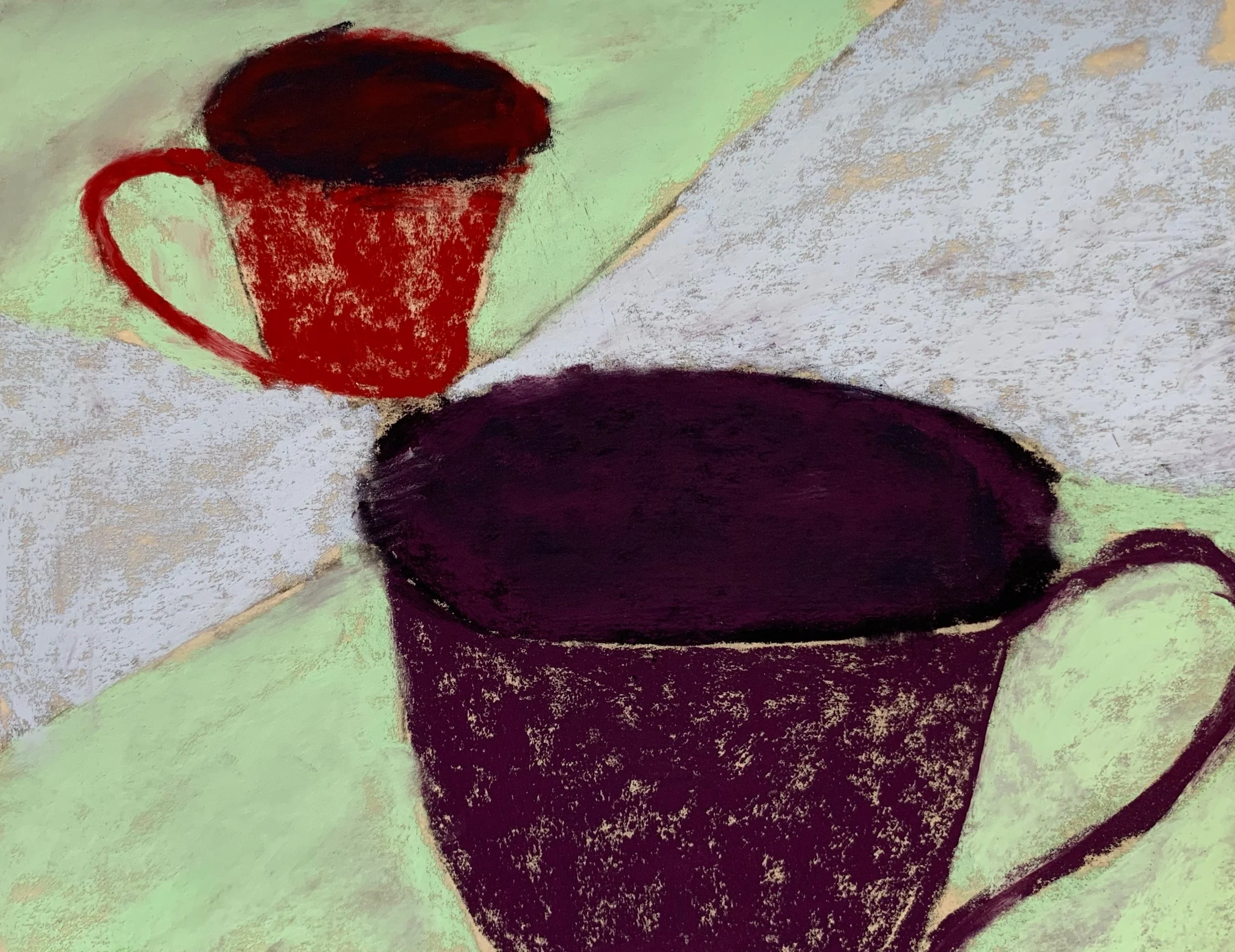
In the morning we worked from a busy still life
and began by doing zoomed in thumbnails.
(line)

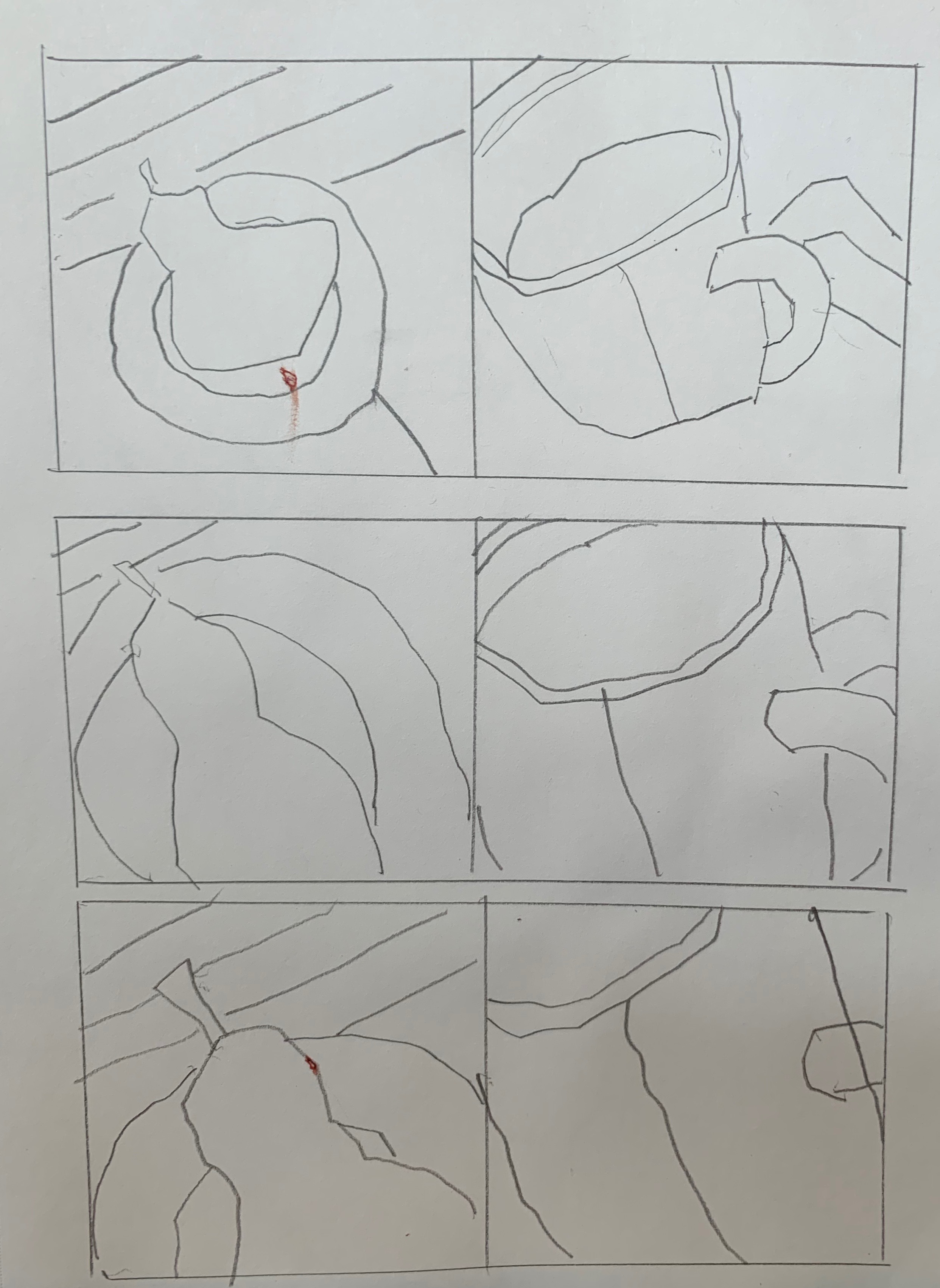
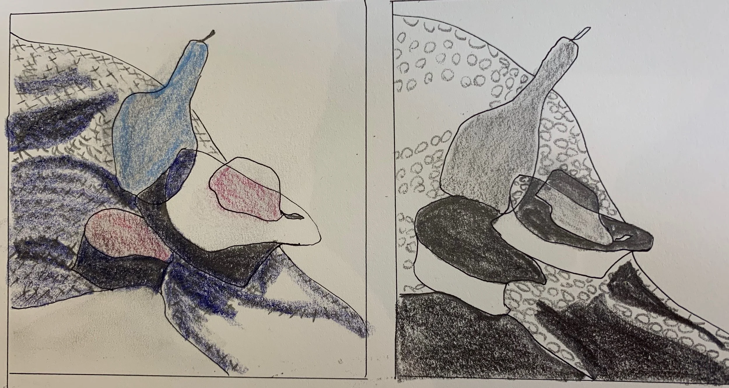
From those, we chose our favorite and designed
two different value studies using only three values.
(shape)
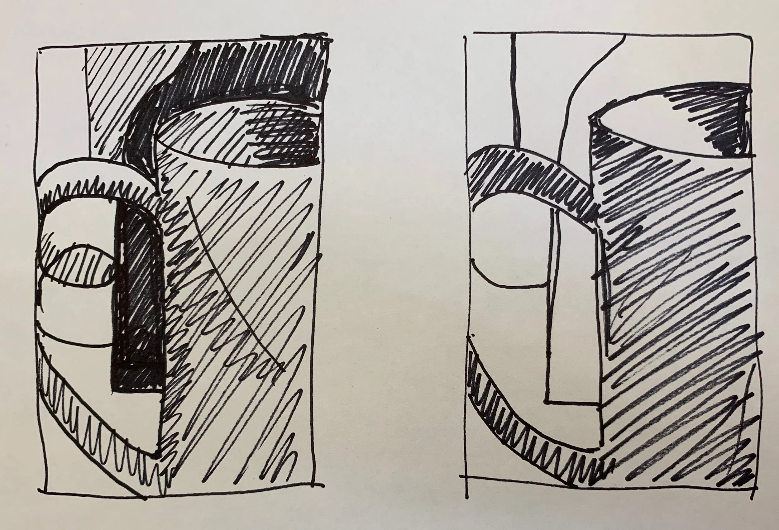
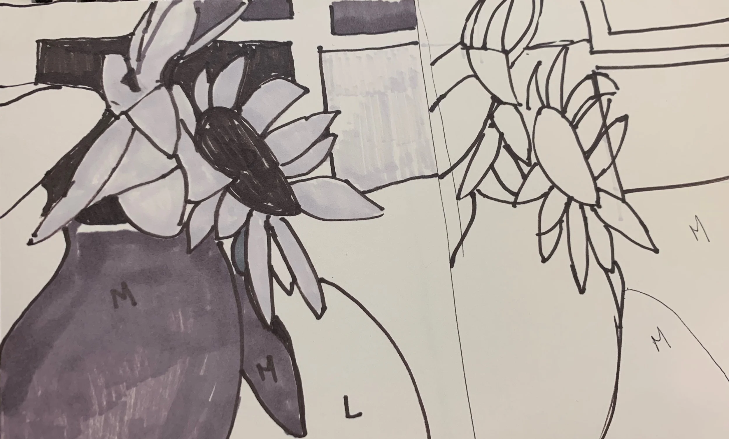
Then we added “made up” color,
matching the value plan in our design.
(Color)
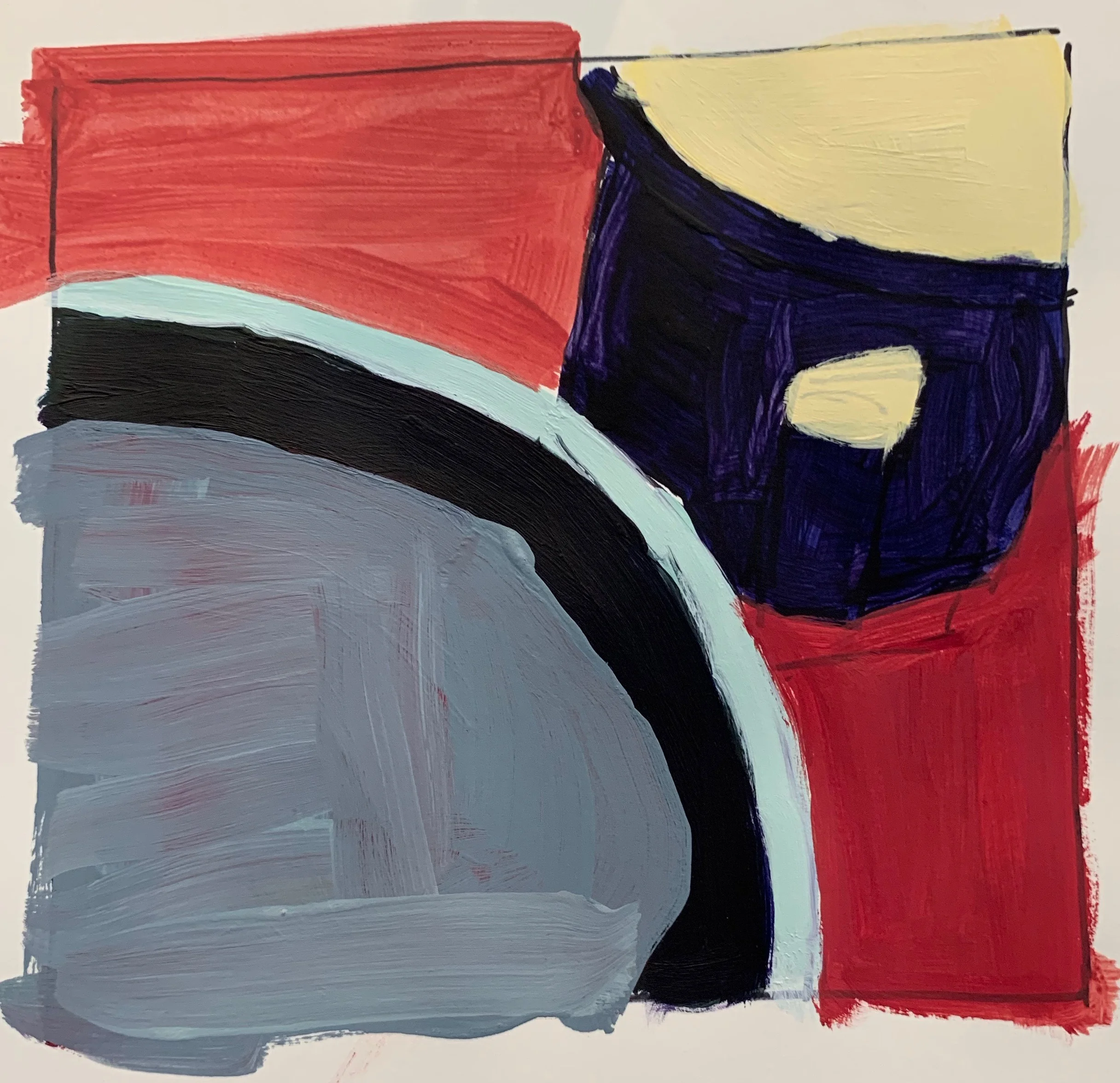
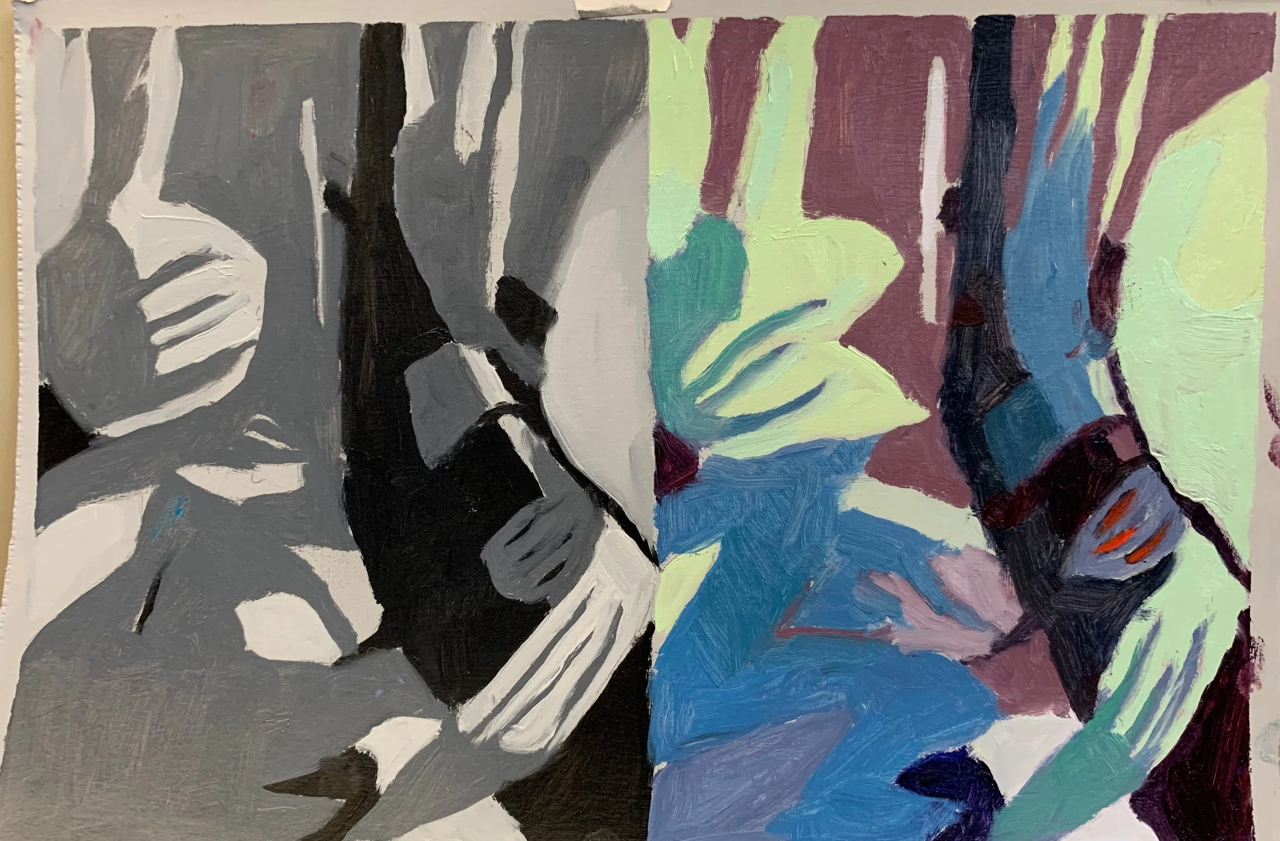
In the afternoon we painted from upside down
black and white images, using a limited color range.
(Color)
Then we painted over an old painting,
manipulating the surface with knifes, scrapers,
chacoal etc.
(Edges/Surface)
We packed a lot in to one day, and only scratched the surface of ways to push our paintings beyond the expected.
More to come.
NOTE:
This was an open medium class and we had
6 pastel painters, 1 watercolorist,
1 oil stick, 2 acrylic, and 1 oil painters.
Interesting to see the exercises
translated to these mediums!
Great work everyone.
As the world begins to wake up from the long winter,
I'm already thinking about the beach.
I arranged this from a few different images taken last season.

”Vitamen Sea”
16 x 16 acrylic on paper
Not sure what it is about using acrylics on Canva paper,
but I’m finding it very freeing and fun.
I’m teaching a one day workshop this weekend
at North River Arts
”Breaking the Literal Habit”.
Many artists reach a point when they
want to go beyond painting what’s in front of them.
We’ll be exploring ways to use the elements of design;
line, shape, color and surface to make
more expressive, personal paintings.

Orange Sky
8 x 8
For the “making up color” exercise,
we’ll be using upside down black and white images
as a reference.
Can’t wait to see the results.
I recently did a series of small studies exploring
new ways of depicting
an old favorite subject;
Beach cottages.

“Orange Sky”
8 x 8 oil on paper
I’m preparing for my one day workshop
”Breaking the Literal Habit”
coming up April 27 at the
North River Arts Society.
NOTE:
That house was NOT “literally”
yellow and purple.
Again, I’m thinking about how to arrange
shapes of color in compelling ways.
Here, I used the pink chair to
bring the viewer in toward the focal point;
the figure and red bathing suit.
(A work in progress)
I’m experimenting with ways to create more
personal and expressive compositions,
without merely copying what is in front of me.
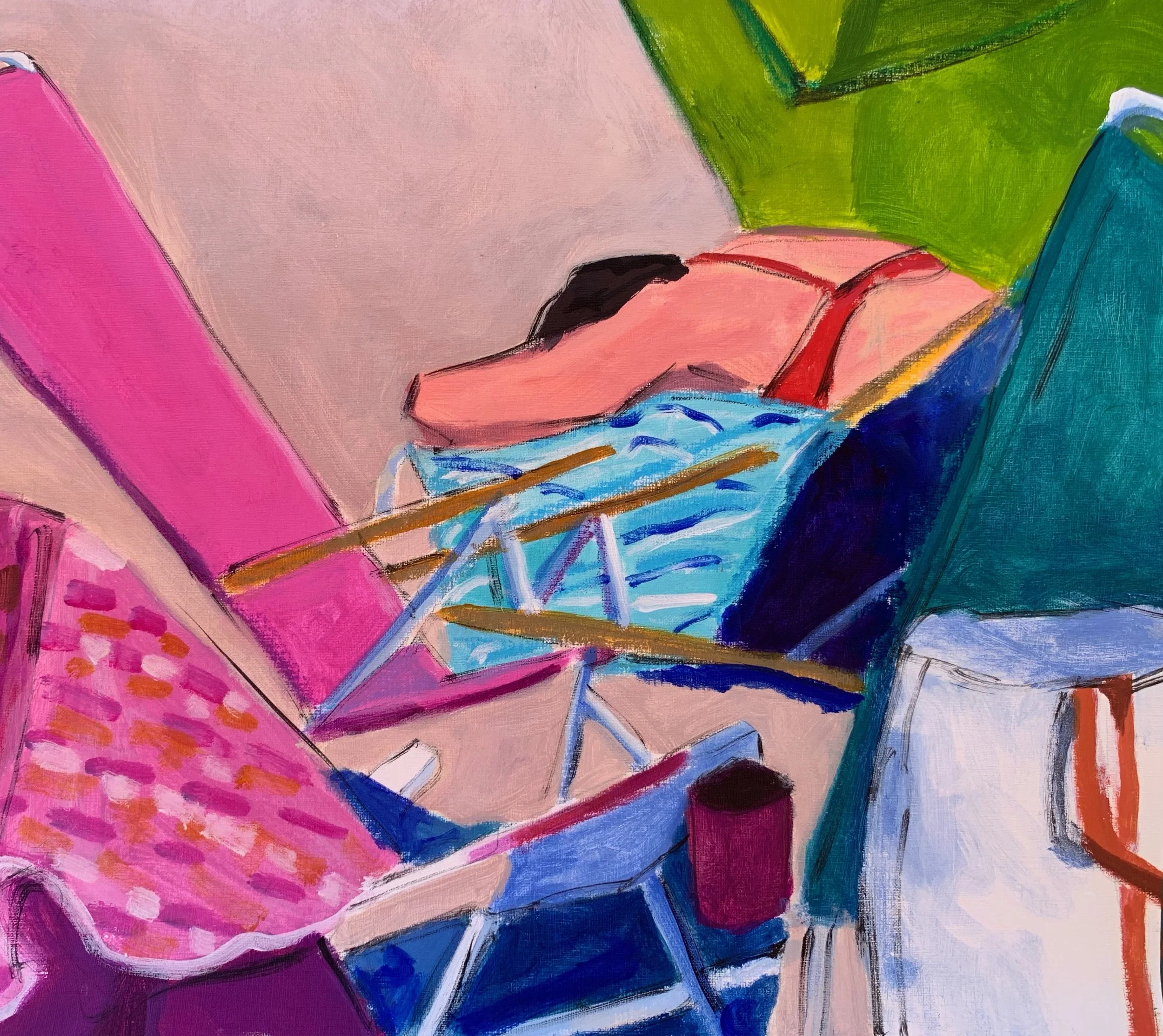
“Alone at Last”
16 x 18 acrylic
(Work in Progres)
This is all in preparation for the one day workshop;
“Breaking the Literal Habit”
I’m teaching at North River Arts on April 27.
NO MORE COPYING!
I was struck by this scene at a friend’s house last week
and immediately noticed the
subtle repetitive shapes.
This is a design concept that I’ve recently been introduced to;
never considered before,
and am now acutely aware of!


”Cat Heaven”
20 x 16 acrylic
NOTE:
I was happy to donate this to the
Hull Seaside Animal Rescue
20th Anniversary Fundraiser
South Shore Art Center
April 26th 7-9.
One of my pals is an avid cat lover
and a dedicated volunteer there.
After these many months of the darkness and cold,
I’ve been yearning for some color and warmth.
I went to my “Images to Paint” file and put this composition together,
using a few different photos.

“Thinking Summer”
14 x 18
A decidedly looser approach for me;
even I was surprised.
Happy Spring!
This week we did self portrait collages in the
mixed media class I teach to residents at
Linden Ponds,
a local Independent Living facility.
I thought I’d share a few of the surprising results.

This woman just returned from the Caribbean
where she did a lot of snorkeling.

This woman enjoys music, reading, and gardening.
And she told me her hair is “every color under the sun. “

This was so carefully and beautifully executed.
Those are her eyes!

This one is 3- D!

David told me he “had a ball”doing this.
And that’s all that matters.
ENJOY!
When my friend told me about her Grandaughter
shopping for her first prom dress,
I asked if she had images.
I’ve been looking for figurative subjects
and am experimenting with texture
so this was just perfect!

First Prom Dress
20 x 16 acrylic and oil stick
That fabric!
I lightly applied a little red oil stick
and then rubbed it in
to get the see- through affect.
Using thinner paint on canva paper
is all new to me and I’m excited.
I
I think so.
When I have some attachment
or passion for a subject,
it usually shows in the work!
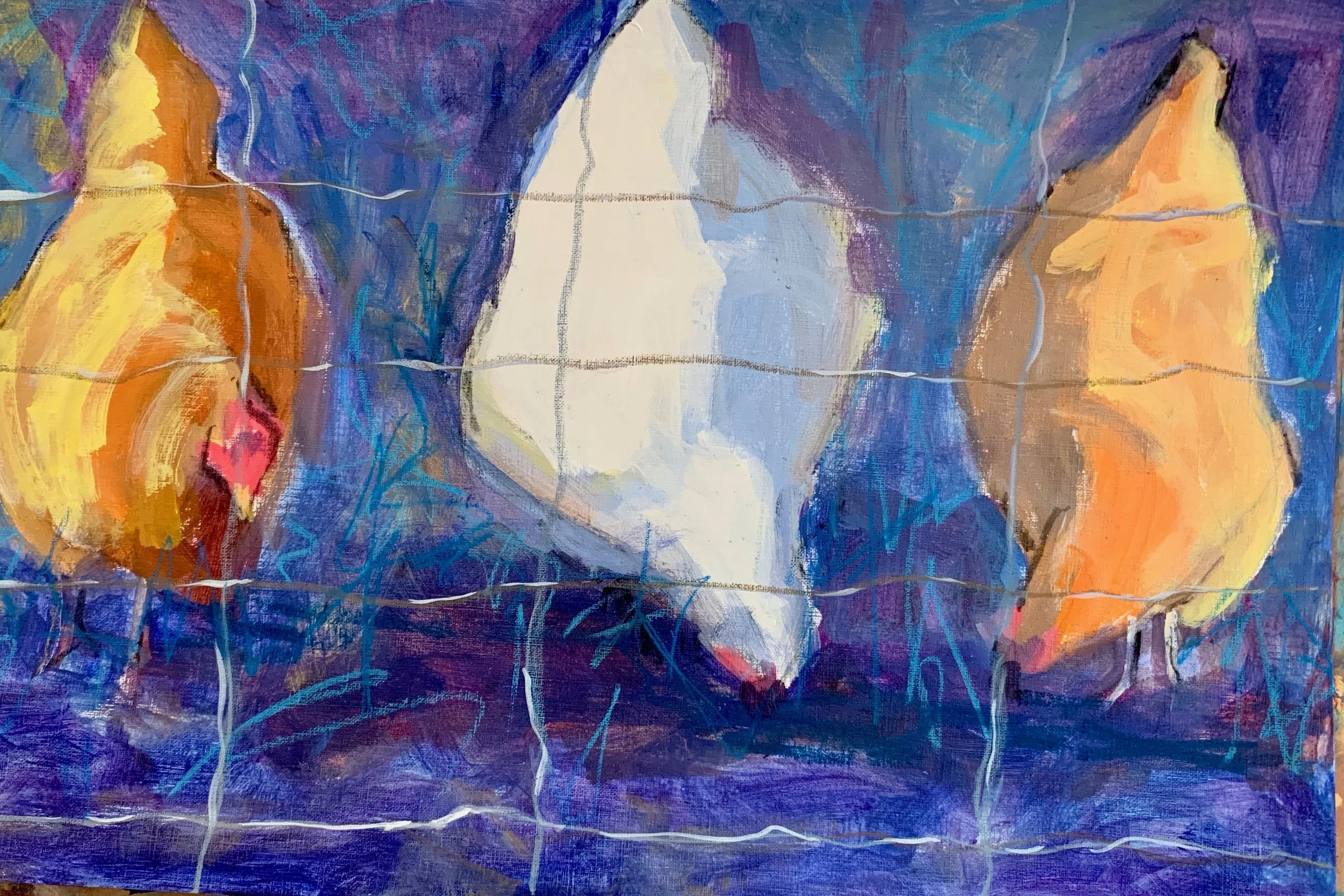
Girls Night In
12 x 20 acrylic and oil stick
I’ve always been fascinated by chickens
and could watch them for hours.
Their shapes and body language are so
expressive, making them fun subjects to paint.
Whenever I paint to fulfill someone else’s vision;
a commission, a gallery owner, a juror, an instructor;
the work tends to feel stiff and dishonest.
So I’ve learned to try to just “paint what I love”.
I got out my “Images to Paint” file and found these gals,
owned by a dear friend mine,
(who happens to have three girls.)
I’ve been looking at different ways of mark making
lately and I’m getting some surprising results.
I recently did this quick watercolor sketch
adding marker, charcoal, ink and oil stick.

Feeding Time
5.5 “ x 8 “
Then I used that as a reference to do this larger version.

Feeding Frenzy
16 x 16 acrylic, ink, oil stick
I really enjoy working with acrylics on Canson canva paper;
the immediacy and ability to use different mediums with it
makes for some fun, spontaneous, and intutive mark making!
As the winter wanes (well kind of)
there are shows and open studios popping up everywhere.
I’m excited to be a part of the
National Association of Woman Artists
Juried Show “Places and Spaces”
opening this Friday March 1 from 6 - 9 pm
at the Alternative Art Space
460 Harrison Avenue #21C

“From Above”
12 x 12 acrylic
This is just one of the many openings that evening
in conjunction with the SoWa
art district First Friday Open Studios 5 - 9 pm.
A fun night for everyone!
Come by if you’re in the area!
It’s been re-affirming lately to hear so many artists talk about
the tendancy to over think and over analyze our work.
I’ve been doing alot of that lately
and it’s been getting frustrating, so last week
I decided to just play at the easel and did this.

“Hen House”
18 x 18 acrylic and oil stick
I literally did not think about this while doing it.
and I had a ball;
finally letting “the muse” do her thing.
Once you stop thinking so much
about the “rules” and getting it “right”
the magic can happen.
I guess that’s the on going challenge.
I think this is finally finished.
It has been through many phases and changes.

Red Towel
20 x 16 oil
I’m experimenting with moving the eye around a painting.
Here, the towels are the obvious focal point,
and the verticals and diagonals
bring you around the entire painting.
At least, that is what I’m after.
I’m noticing that many of the artists
I’ve been exploring lately profess:
“Take risks!”
”Embrace Chaos”
“Your paintings will be richer when you struggle”
”It’s OK if it’s wrong”

February Favorite 12 x 9 oil
I worked on this over a few sessions;
scraping things out, changing values,
and using different tools.
I find this way of working a bit scary,
yet exciting and engaging!
I like it when some of the painting’s
“history shows”.
Happy Valentines Day!
After many weeks of exploration, I have finally
upgraded my website and blog.
I can thank Susan Davis and SHD Marketing for all her tireless help!
I highly recommend her services;
she’s patient and kind with those who are not so technologically savvy!
I hope you continue to enjoy my posts
and let me know if you have any comments!
(This is a test run)
I have at least ten "works in progress" in my studio right now,
which is a totally new way of working.
That said, I've been away from the studio for a while so I couldn't wait to start something fresh today.

Today's WIP
24 x 24 oil on canvas

Here is the image I used for inspiration, turned upside down.
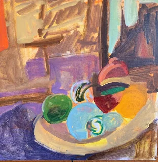
The initial "lay-in";
Once I turned it right side up,I made a few adjustments and will now re-visit it when it's dry.
And after I've looked at it for a few days.

This new approach is teaching me to let things happen and "accept chaos" along the way. The biggest challenge is to prevent myself from over working it by "fixing it".
Will keep you posted.
HI there, I've been thinking about kitchens as a subject lately,
(Probably because I spend so much time in them this time of year.)
I've had an image of my friend's kitchen
in my files for some time
and finally got a chance to play with it.

Donna’s Kitchen 12 x12 oil
While watching the Pats game
I played with a small pad, marker and watercolors.
Trying to think abstractly
I started with 5 shapes of varying sizes and color.
No reference.


That didn't last long.
This became the pizza we had during the game.

This became an appetizer plate

And of course, a beach scene.

It's funny how our brain reads shapes and
we immediately identify them as something.
I find it a challenge to think of
just shapes and their relationships with each other.